Introduction
I am going to detail here my personal journey through Gestalt Theory. It took me around fifteen years to get a proper look at this topic. Gestalt is not a term you will hear a lot in a studio, but it can be very helpful when it comes to composition and lighting. Because our job is so dependent on the framing of a shot.
Gestalt at school
Back in 2006, I had a teacher at Supinfocom, called Marc Bigeast, who was very interested by Gestalt Theory. During my two years of study with him, he mentioned the concept a lot. He mainly described it as a theory of the shapes.
Back then I did not realize its importance because I was so focused on CG stuff (such as specular values, if I should use a Blinn or a Phong material and displacement maps…). And the theory seemed a bit old-fashioned. But, Gestalt is at the very heart on how we read pictures.

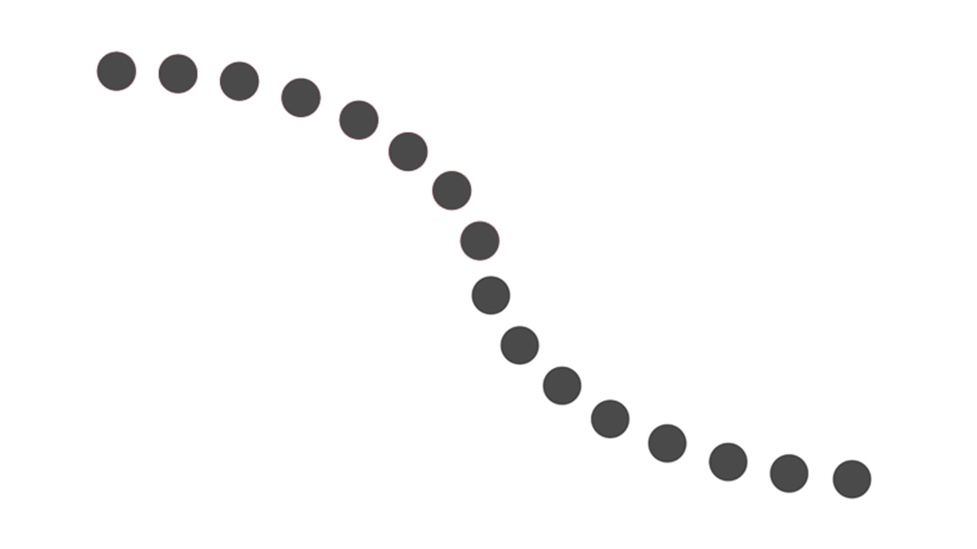
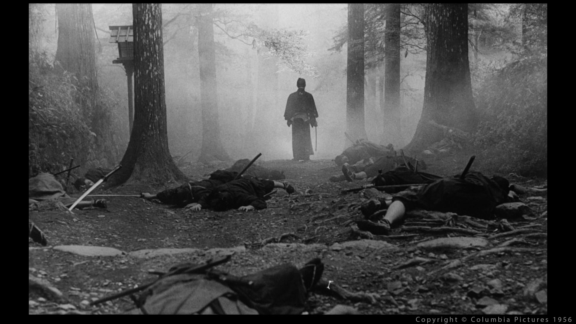
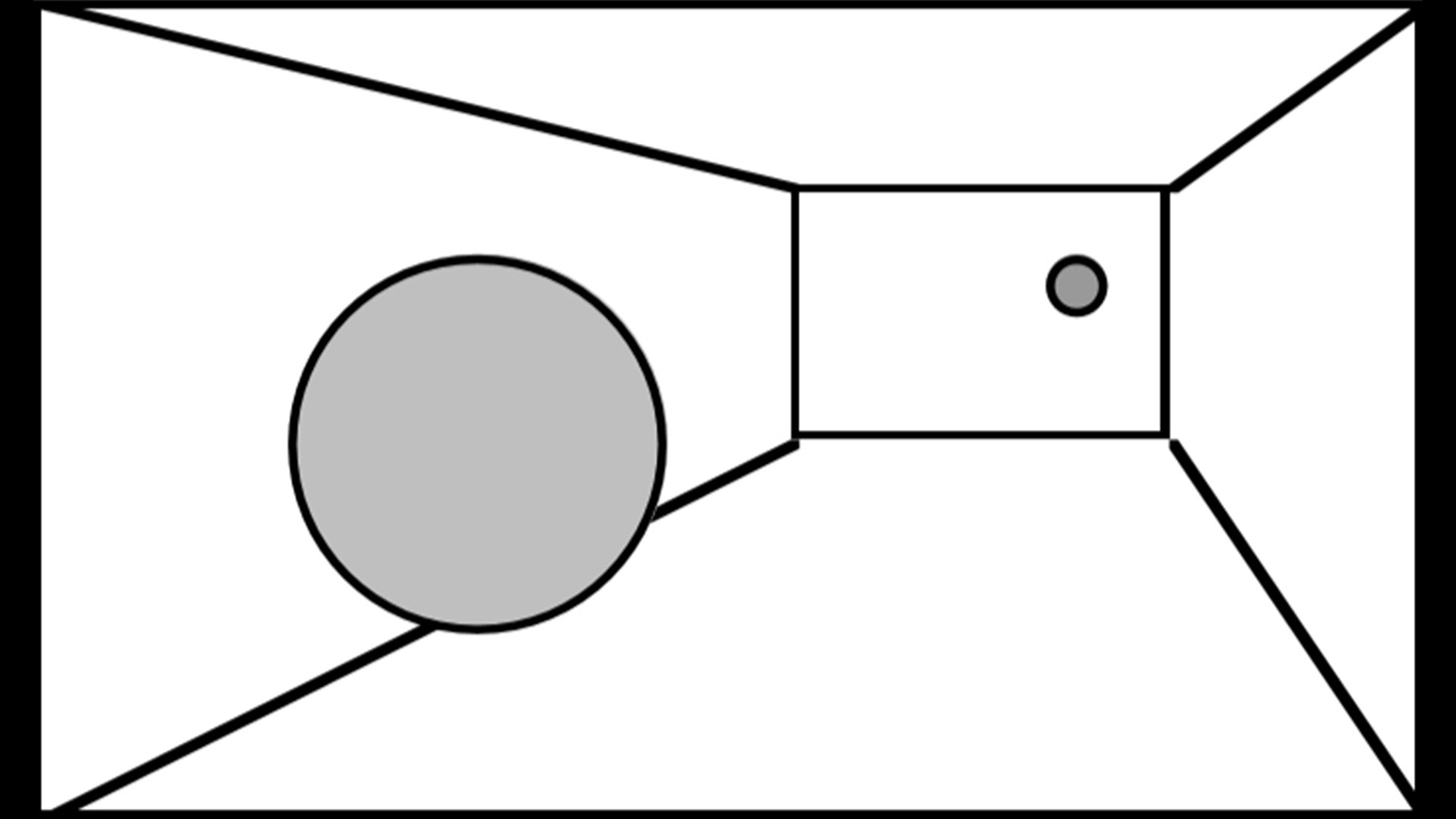
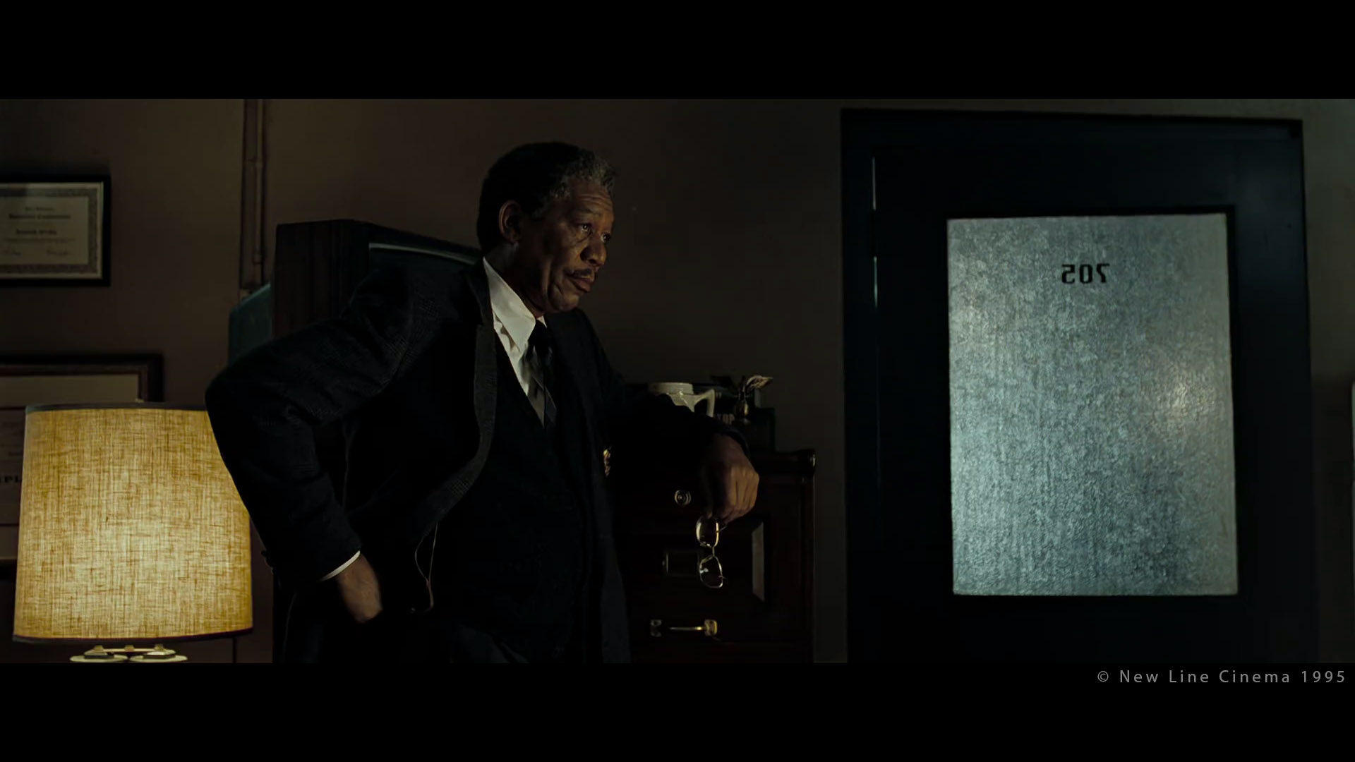
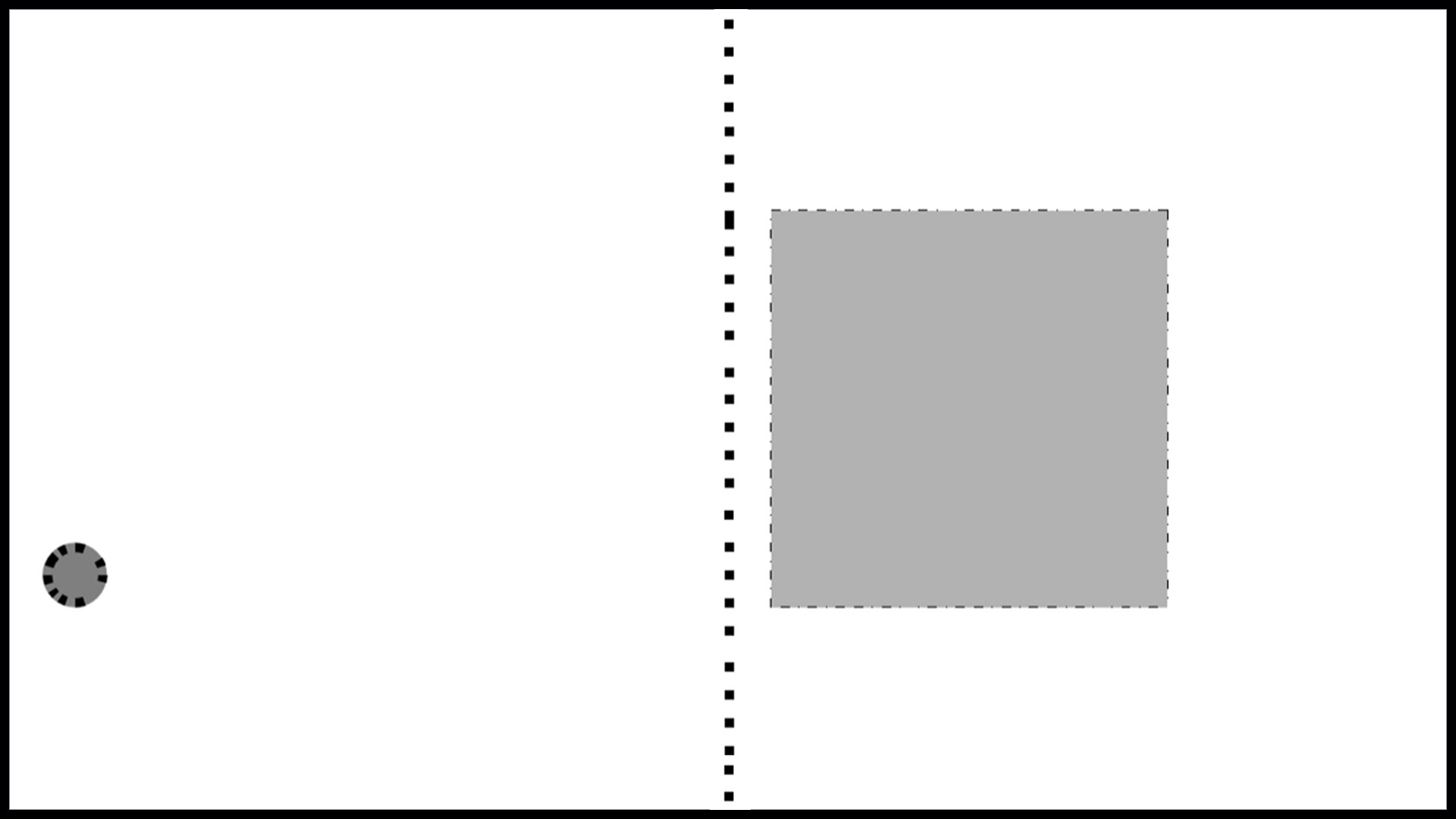
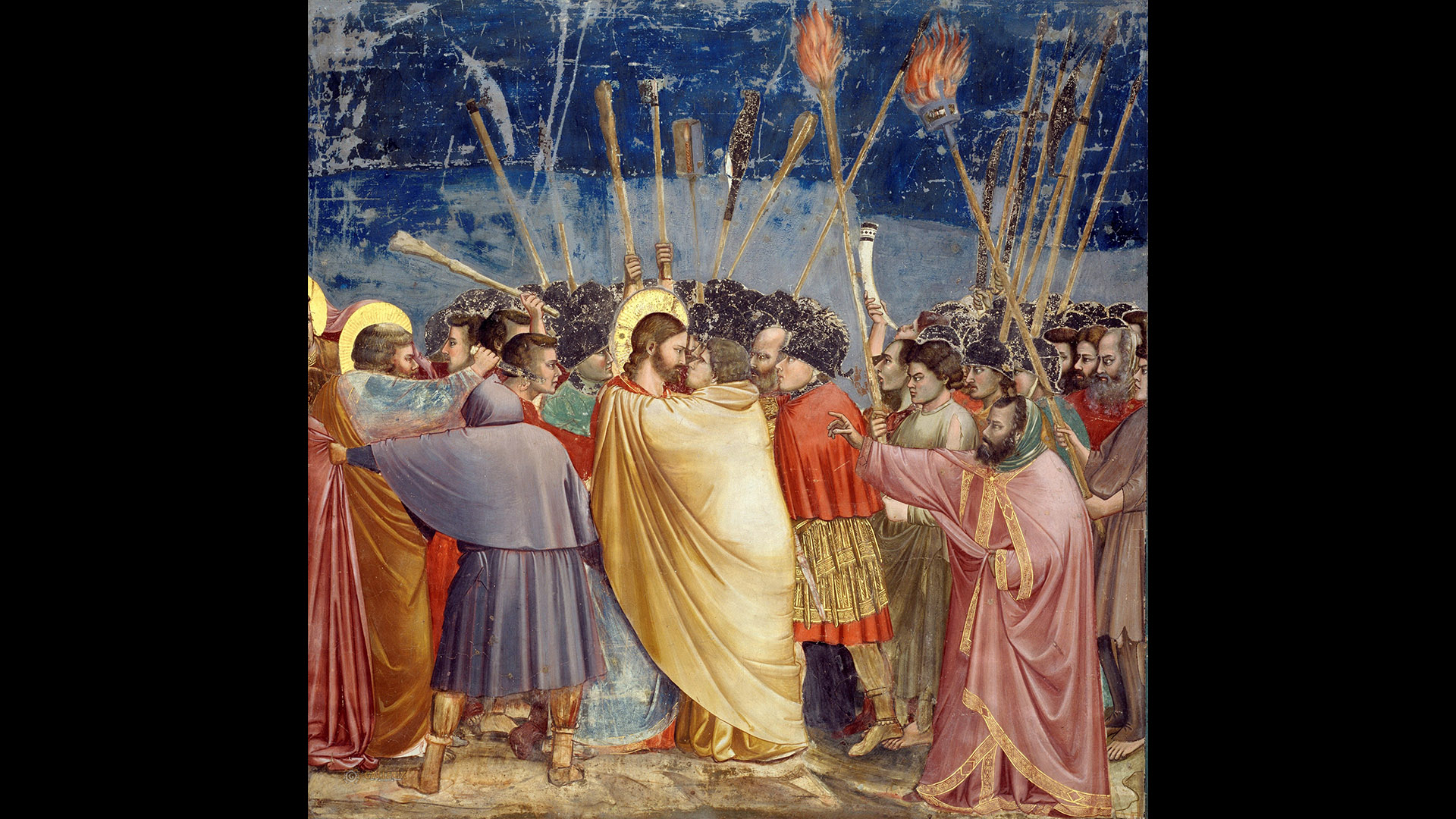
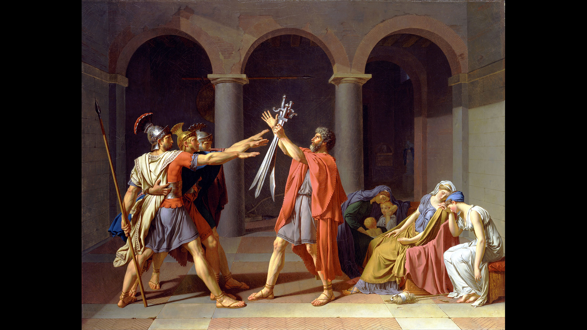
As a student this example can be unsettling.
To be honest, I was discovering Maya at the same time and I felt so overwhelmed by the amount of data to process that I kinda lost track of my main purpose: making great pictures. Anyway, after graduating, I forgot about Gestalt and went on with my career.
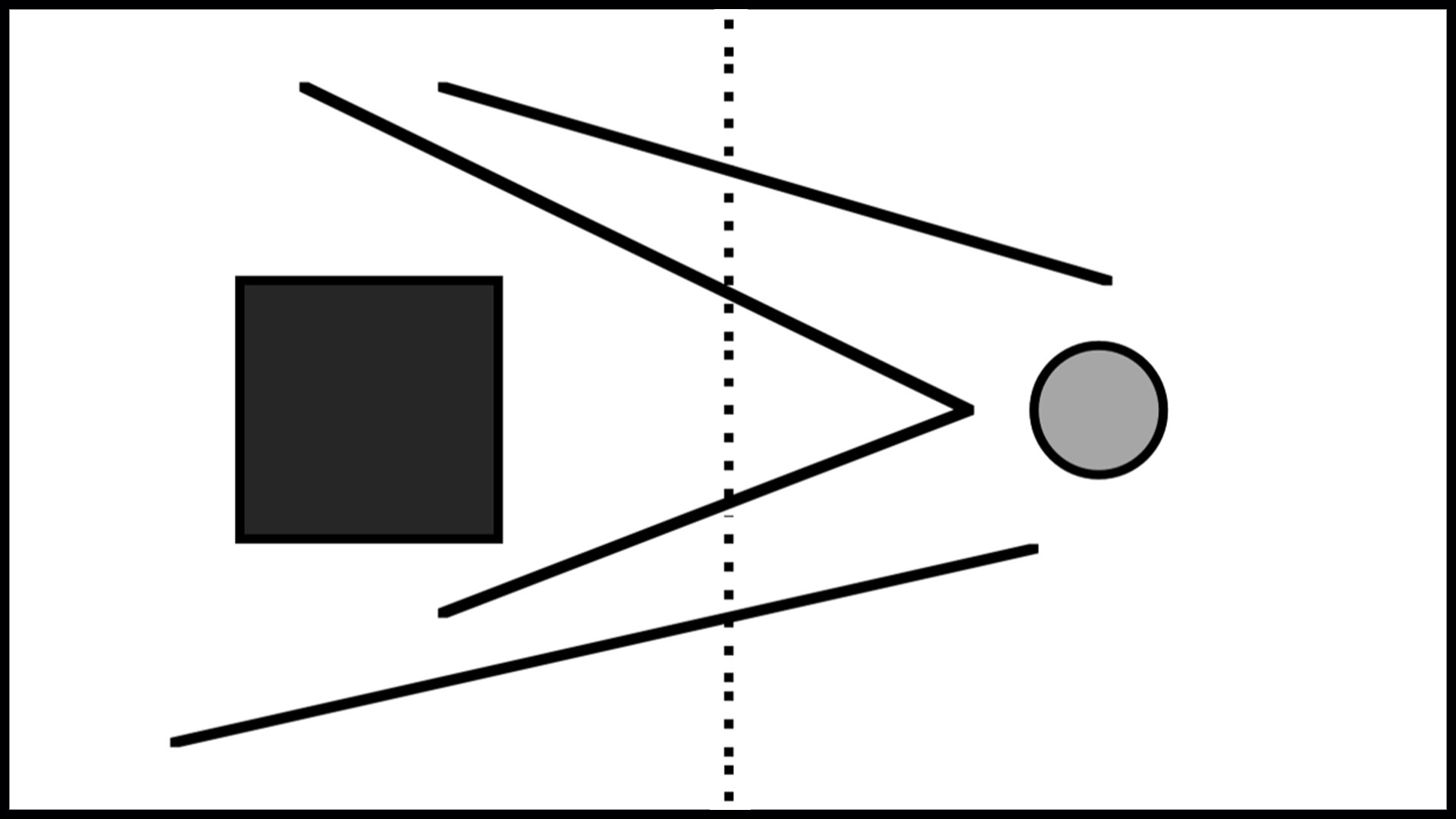
If only I could have connected the dots, I would have realized that this Pixar short film was using Gestalt Theory on almost every shot.
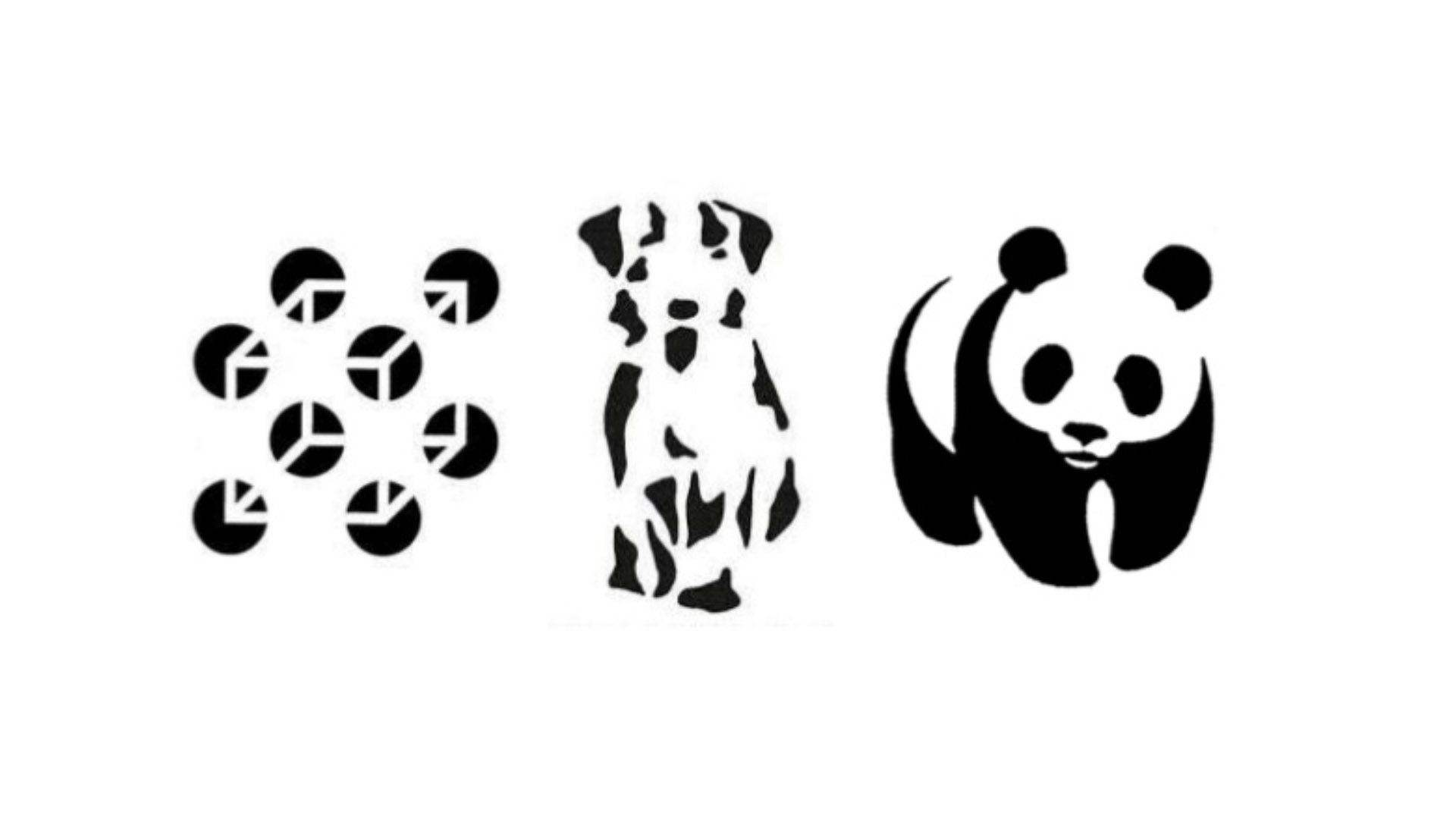
Wikipedia uses the term “Gestalt Psychology” probably because the Gestalt principles exposed in the early 20th century were then taken up by psychoanalysts and theorized into a new form of therapy (the Gestalt Therapy).
That is basically the same concept. A more accurate term overall would be “principles of perceptual organization.”
Gestalt and Pixar
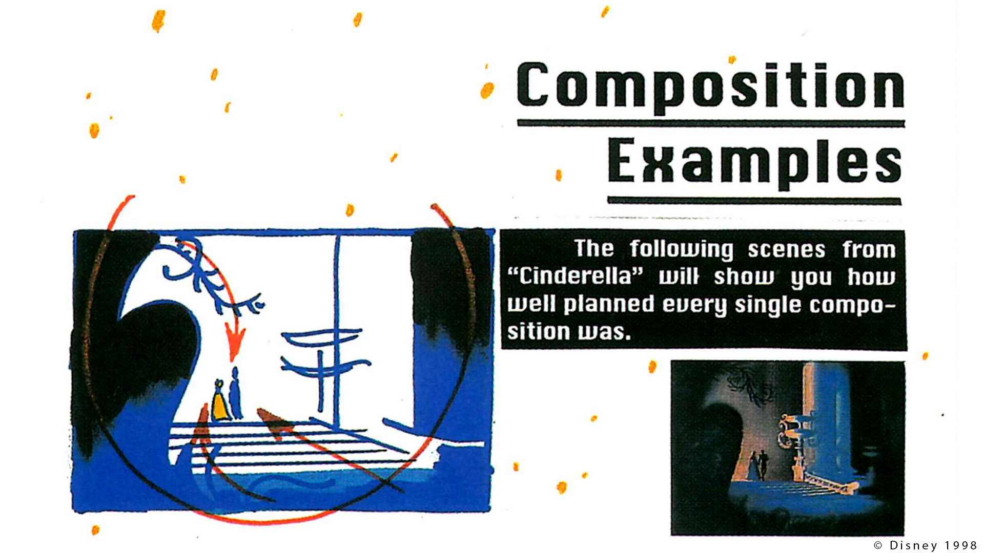
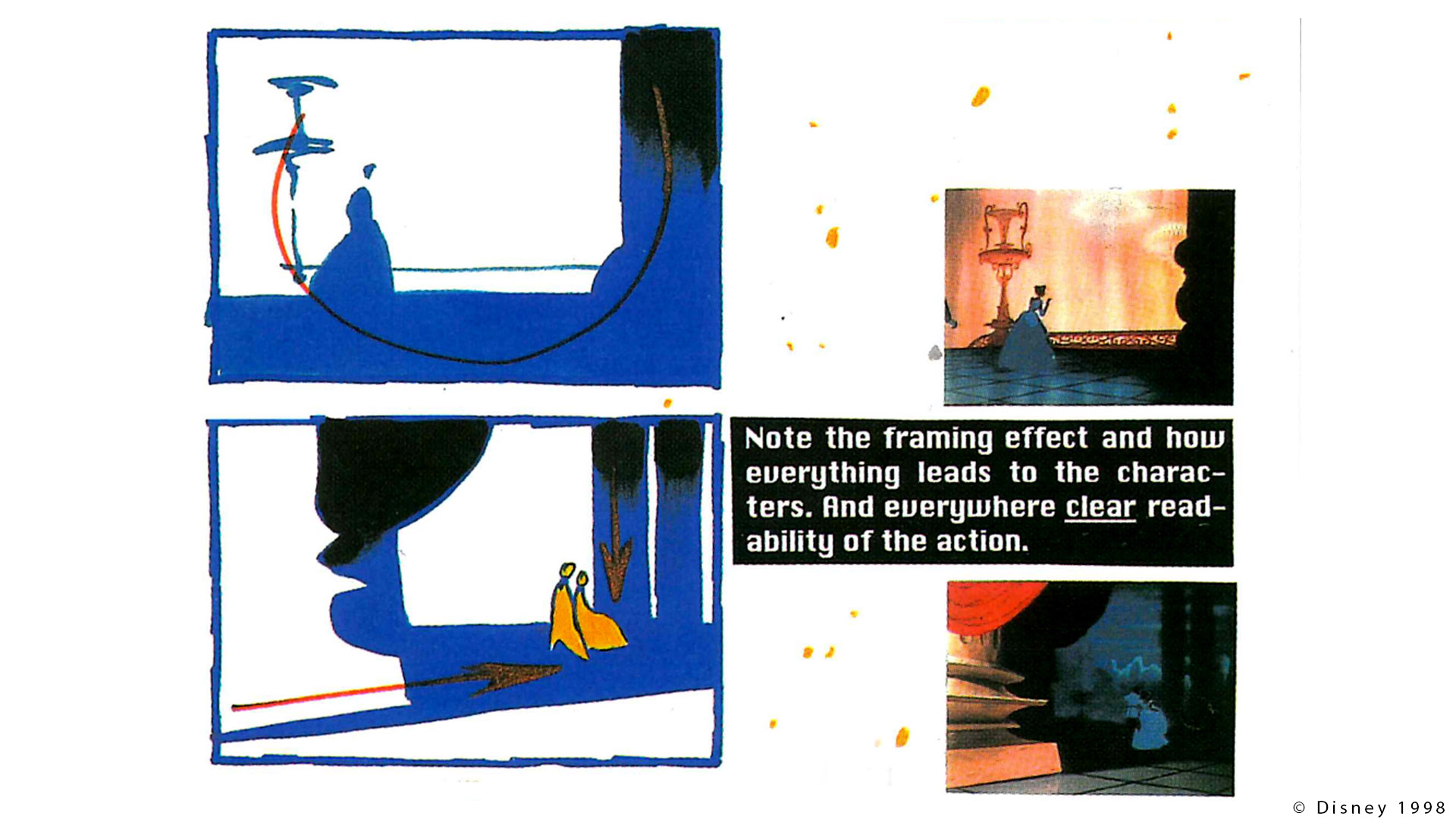
Thirteen years later, I was doing some research for my book and I found about the Pixel Cinematography course. It is a note from the 1996 SIGGRAPH session where Sharon Calahan talks about lighting principles: “Cool, let’s see what Pixar had to say about Cinematography back in 1996 !“
I guess you already have figured out what is the main topic of this course: Gestalt Theory. I could not believe my eyes ! Pixar talking about Gestalt Theory, exactly like my teacher back at school. Crazy.
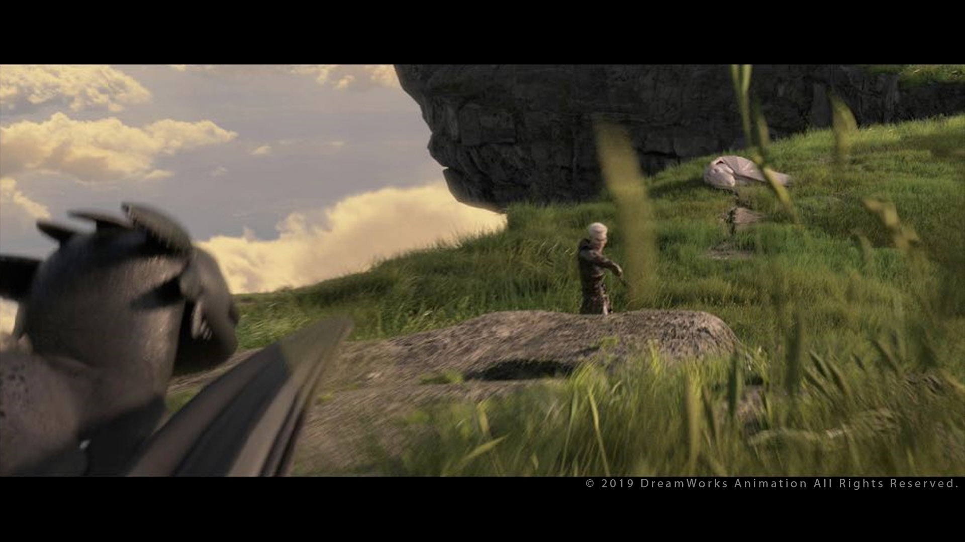
This Siggraph talk was done four years before the short film “For the birds“. It seems pretty clear that all these concepts were used massively at Pixar.
More Gestalt connections
Funnily enough, I also realized that Craig Welsh also mentioned this course in his blog in 2014. I decided to read the course and see what would come out of it. Obviously all the technical parts are completely outdated. Back in 1996, there was no GI, so you had to fake most of the lighting.
But all the Gestalt Principles described by Ms Calahan are still valid. There is one thing I missed though: examples from movies, comics or paintings to illustrate her notes. I guess that during the presentation there were more images, but unfortunately they are not many available in the pdf.
So in this chapter I am going to read through the course, list the Gestalt principles and add some movie examples to make them even clearer.
The Siggraph 2019 course from Dave Walvoord illustrates some concepts clearly coming from Gestalt… But without mentioning the name of the theory itself.
Storytelling through lighting
Calahan Introduction
The part from Sharon Calahan starts like this:
Although much of the content of this course is not solely applicable to lighting on the computer, its special needs are always in mind. Visual storytelling is a vast topic that reaches far beyond the realm of lighting. Most of it is not noticeable on a conscious level to the viewer, but adds depth and richness to the story and the visual experience.
Indeed, Gestalt theory is not only about lighting, but also about composition.
My teachers always told me: composition is the most difficult part of an image to come up with. But once, you have it figured out, the rest should flow naturally. In a movie production, everything is camera dependent: animation, lighting, set dressing… So we rely completely on the framing.
Visionary talk
It is very impressive how back in 1996 Sharon Calahan had already mastered so many concepts, like way before PBR:
The commonality between live-action lighting and computer lighting is chiefly the thought process. […] in this discussion of lighting for synthetic cinema we will find that many live-action concepts apply. It should be kept in mind that the sooner in the production process lighting can be designed, the more involved it can be in the storytelling process.
This is exactly what we did on “Playmobil“ since we were lighting Rough Layout (RLO), only around 20 years later.
[…] it is important to understand the story-point behind each shot, and how it relates to the story as a whole. It is not enough the lighting designer simply illuminates the scene so the viewer can see what is happening, or to make it look pretty.
I agree with this statement. Unfortunately in many productions, pretty is enough.
It was also very smart to focus this talk on Gestalt Theory, because these are timeless principles. And 30 years later, everything is still valid and unconsciously applied in many movies.
What is Gestalt ?
When you type Gestalt Theory in your search engine, you will find mostly tutorials about web design or logos. But it totally applies to any kind of image really. For example, this article explains pretty well the Gestalt principles. Here is a possible definition:
In the 1920s, a group of cognitive psychologists in Germany developed a series of theories of visual perception known as the Gestalt Principles. There is no perfect English translation of the term “gestalt”. But we can interpret it as “whole”, “pattern”, “structure”, “configuration” or “organized unity”. […]
Their work on the perception of the whole rather than the parts from an aesthetic point of view resulted in the Gestalt Theory.
These laws explain our perceptual tendencies and describe how humans typically see objects by grouping similar elements, recognizing patterns and simplifying complex images.
Artists use these principles to engage viewers via powerful -yet natural- “tricks” of composition and best practice design standards.
Gestalt principles
We are now going to start diving in the Gestalt topic. Let’s begin !
The primary objective of good lighting is to show the viewer where to look. Shots are often on-screen only briefly, which means the storytelling effectiveness of a shot often depends upon how well, and how quickly, the viewer’s eye is led to the key story elements. […] Composition is a term which is used to collectively describe a group of related visual principles. […] They are not rules to be followed, but define a structure by which to explore creative possibilities. […] It can also help rescue a less-than-perfect composition.
There are plenty of websites that describe the Gestalt principles. We will try to describe them one by one.
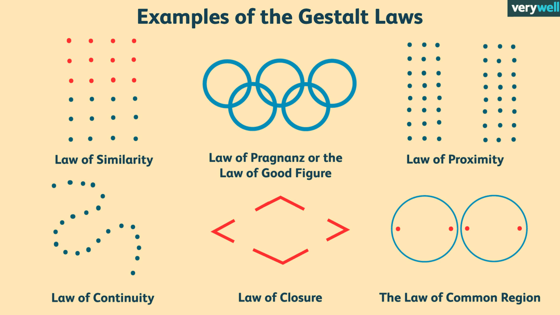
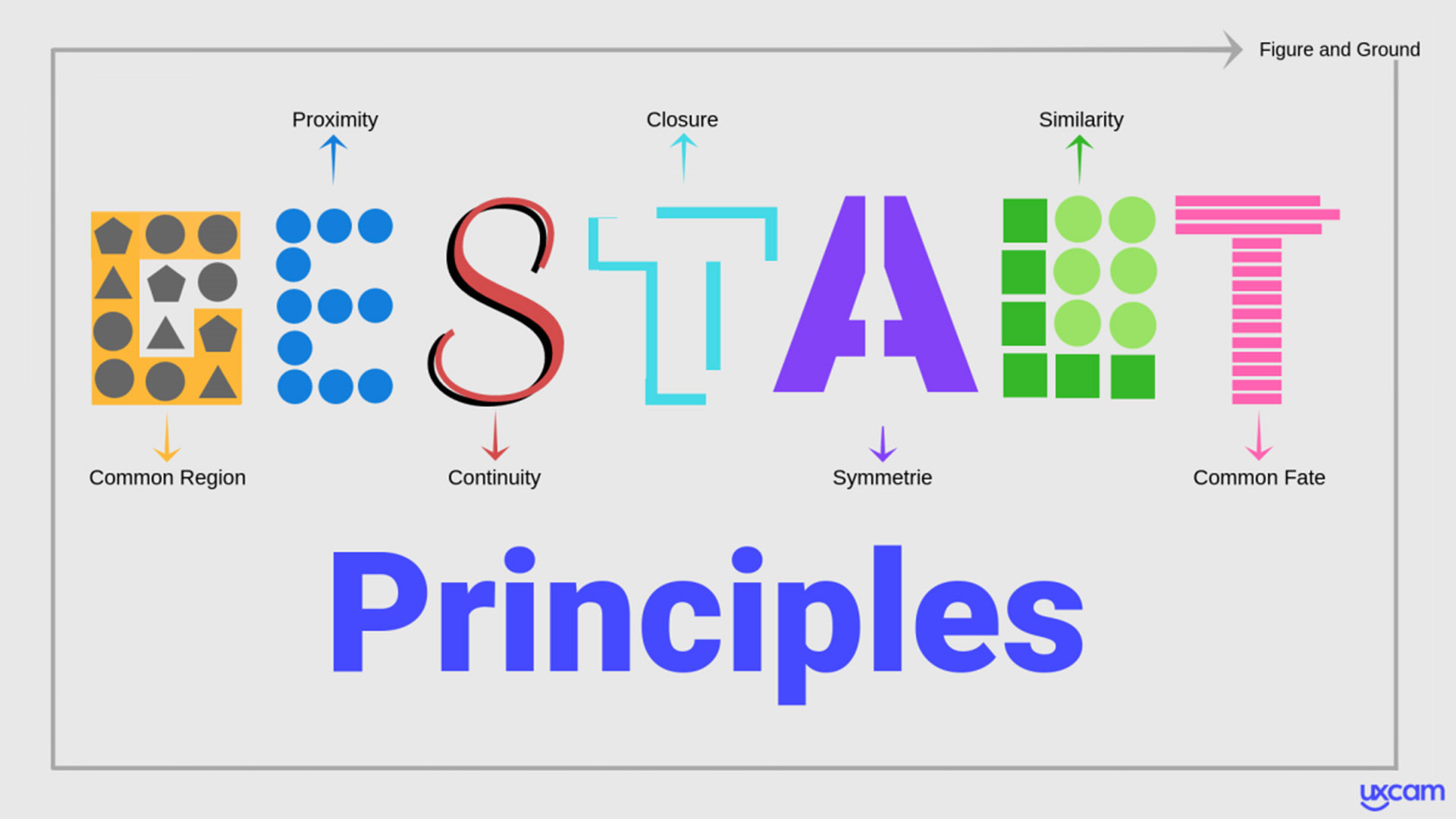
Some of the following definitions come from this article.
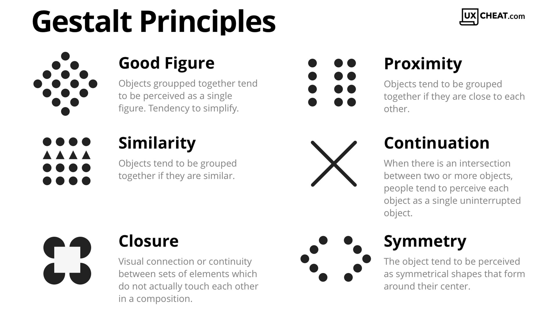
Similarity principle
Similar objects will be counted as the same group and this technique can be used to draw a viewer’s attention.

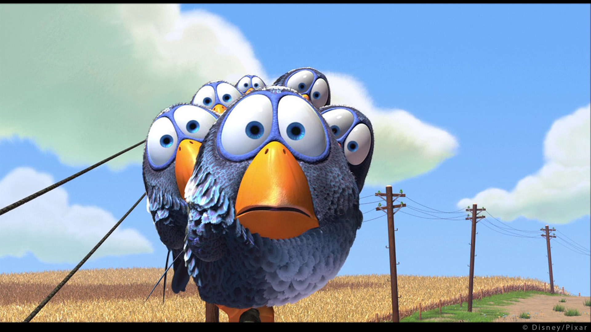
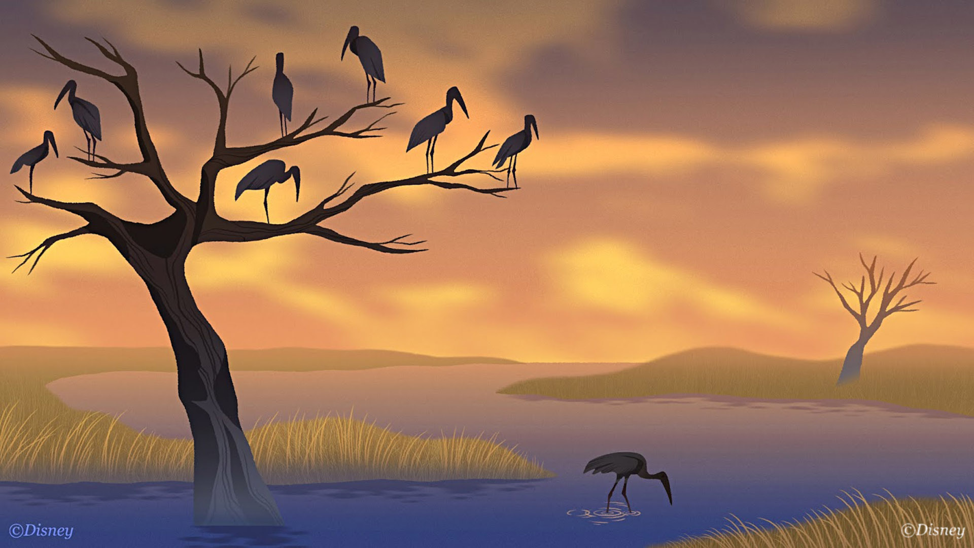
There is a great example of this principle in “Piper”. All the characters are adult sandpipers except the protagonist who’s a baby. The viewer will see the adult sandpipers as a group rather than individuals and will therefore focus more on the main character.
In lighting this principle would be grouping with light and shadow. This process is described by Dave Walvoord:
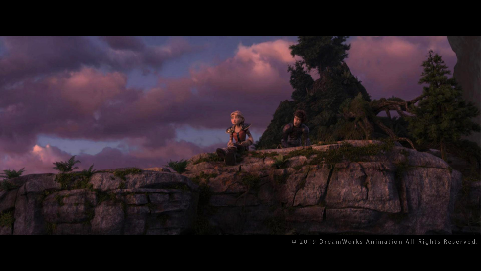
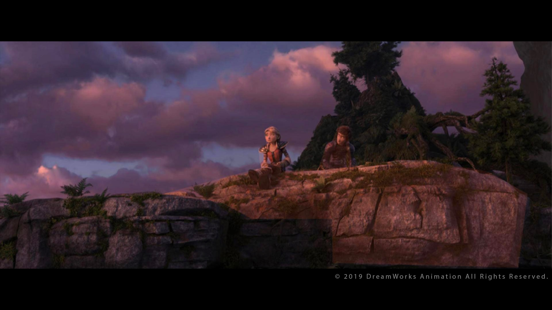
Even if Gestalt is not explicitly mentioned here, it clearly seems related to the topic.
[…] the very large tree behind Hiccup that could easily dominate the frame is flagged into shadow. Great liberty can be taken with the placement of shadows without the audience becoming aware. Shadows generated by off camera objects, such as a cloud in this example, are easily justified regardless of whether or not a cloud exists in the correct location to cast the shadow. […] the audience rarely notices when a shadow in one shot is not present in the following shot as long as the camera is not in the same location. This gives the Lighting Designer great liberty to ignore the continuity of lighting throughout the scene.
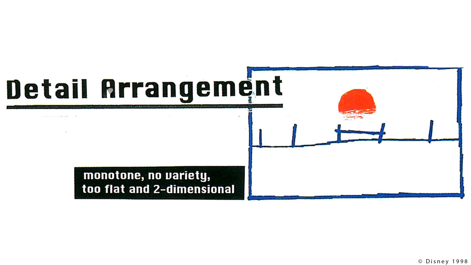
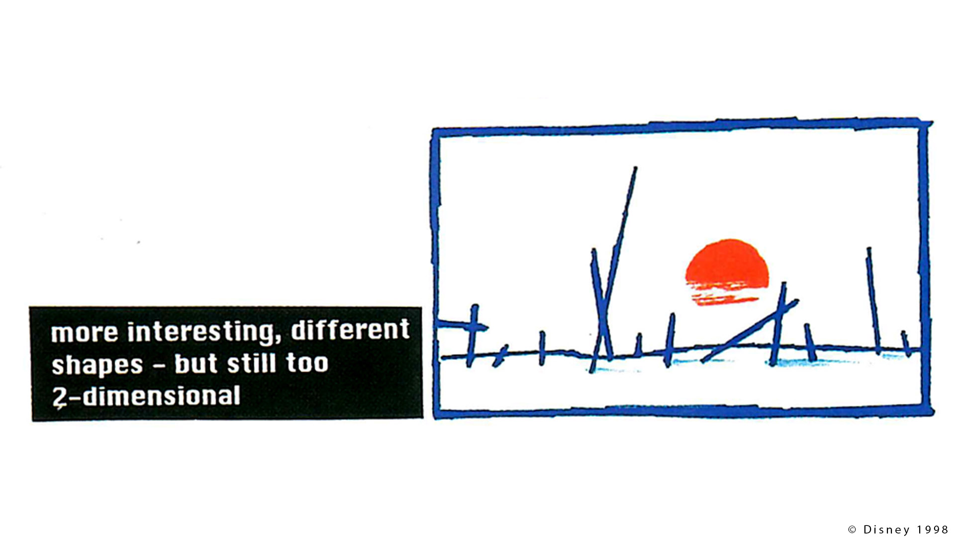
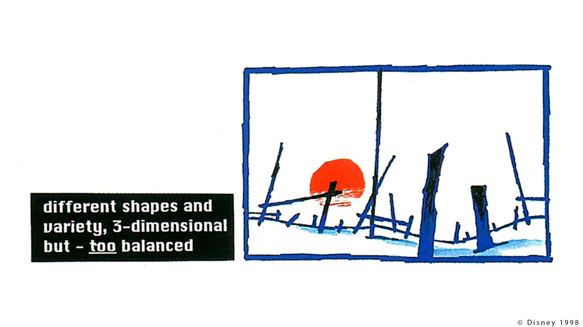
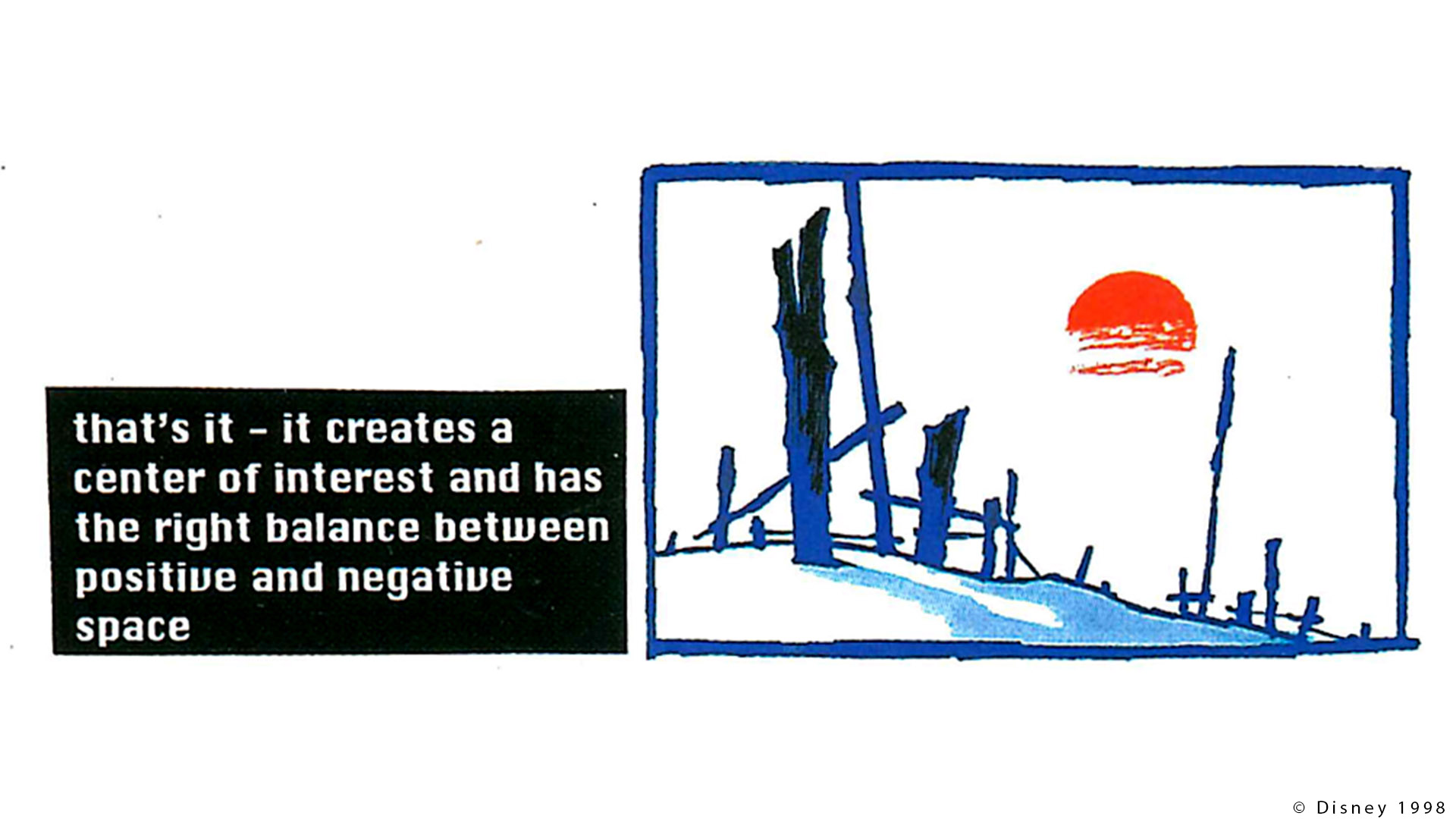
Simplicity principle (Pragnanz or Good Figure)
I have merged both laws (simplicity and Pragnanz) since they are quite similar. Hopefully that still makes sense.
A stimulus will be organized into as good a figure as possible. […] When learners are presented with visuals, there is an unconscious effort to simplify what is perceived into what the viewer can understand.


In lighting it is pretty compulsory to have a clear and simple read on a shot. We do not want the viewer to be guessing if this is light or shadow. There is a perfect example for this in Dave Walvoord’s paper.

Dragon lighting likes to keep a clear delineation between light and shadow. […] the shadow area is now deliberately being used to frame Grimmel and draw attention to him.
Very often the foreground area of a shot will be in shadow. It guides the eye.
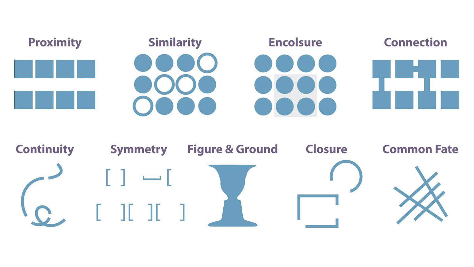
Proximity principle
The law of proximity states that items placed near each other appear to be a group. […] The brain tends to group objects that are close to each other.

Same here in “Up” (Director: Pete Docter). The helium balloons are seen as one group.
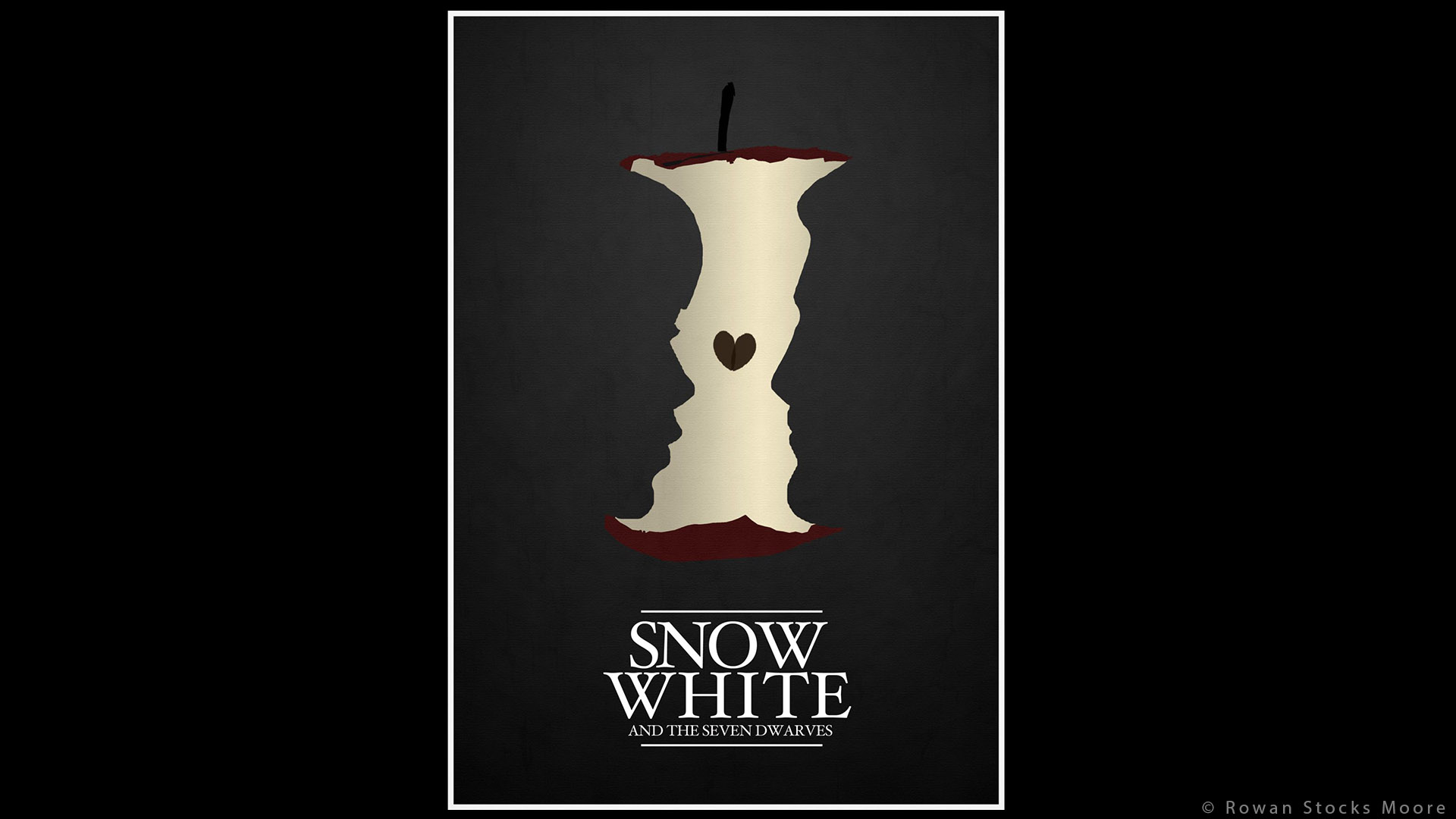
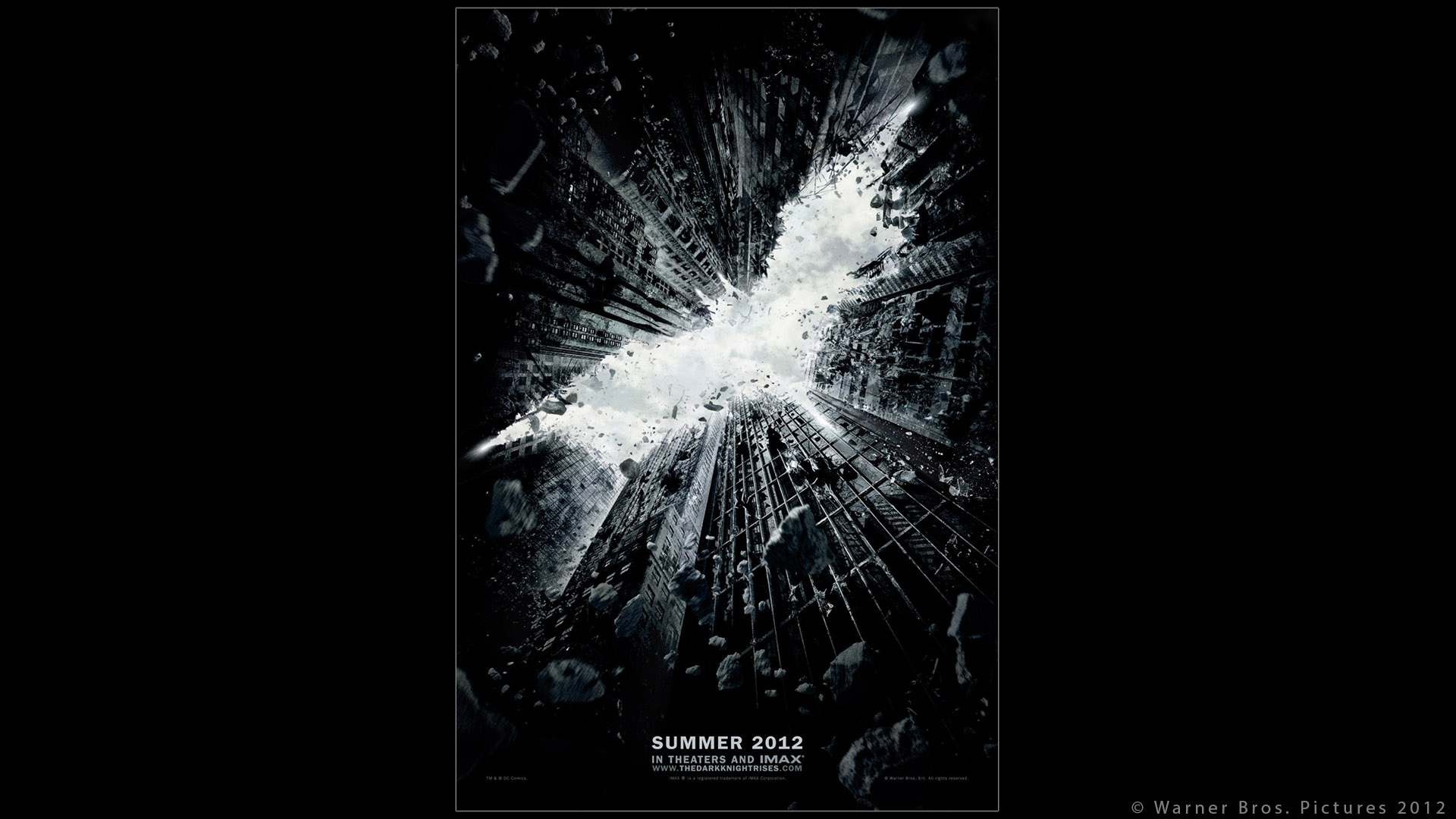
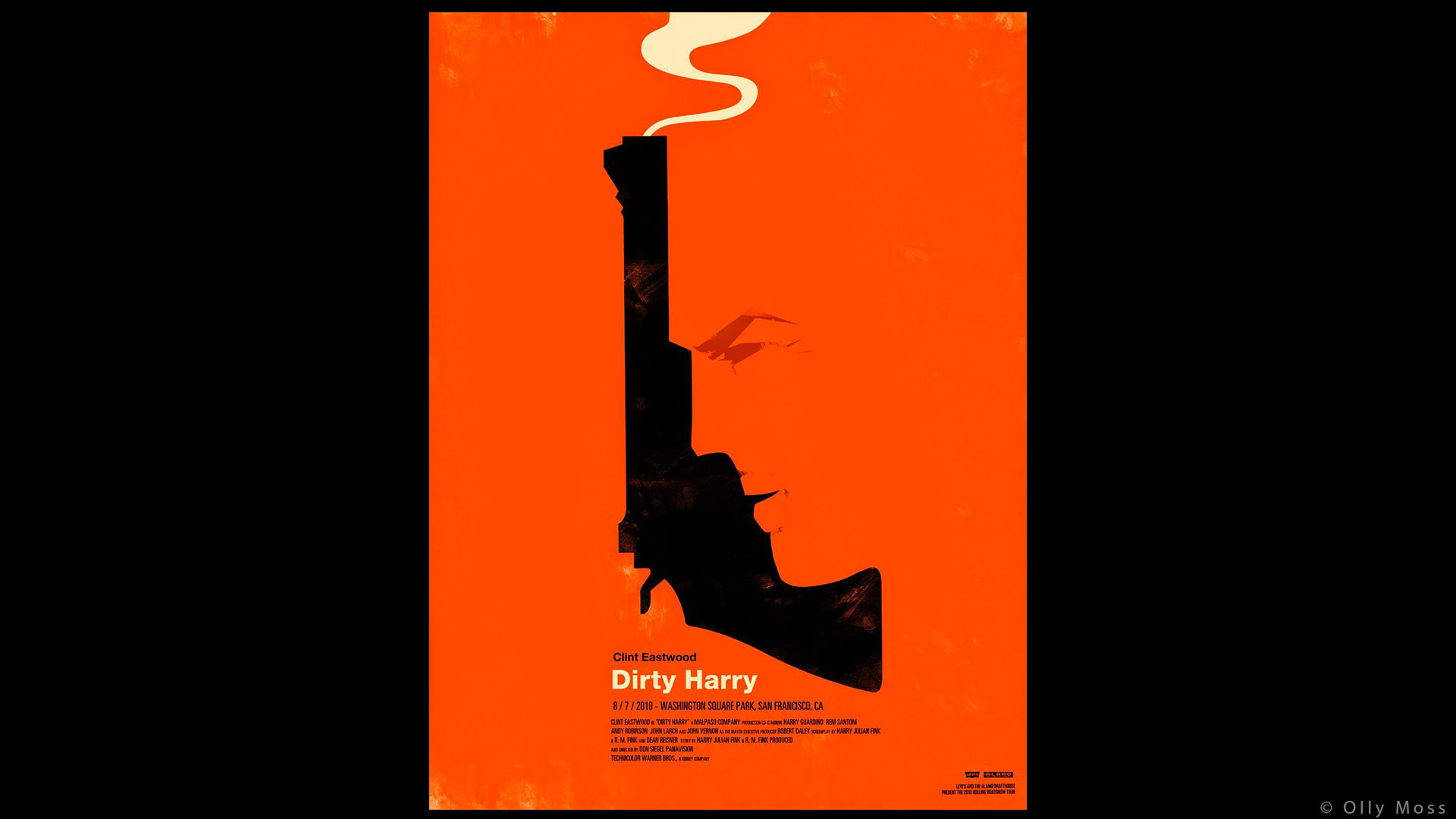
Continuation principle
Continuation is the eye’s instinctive action to follow a direction derived from the visual field.
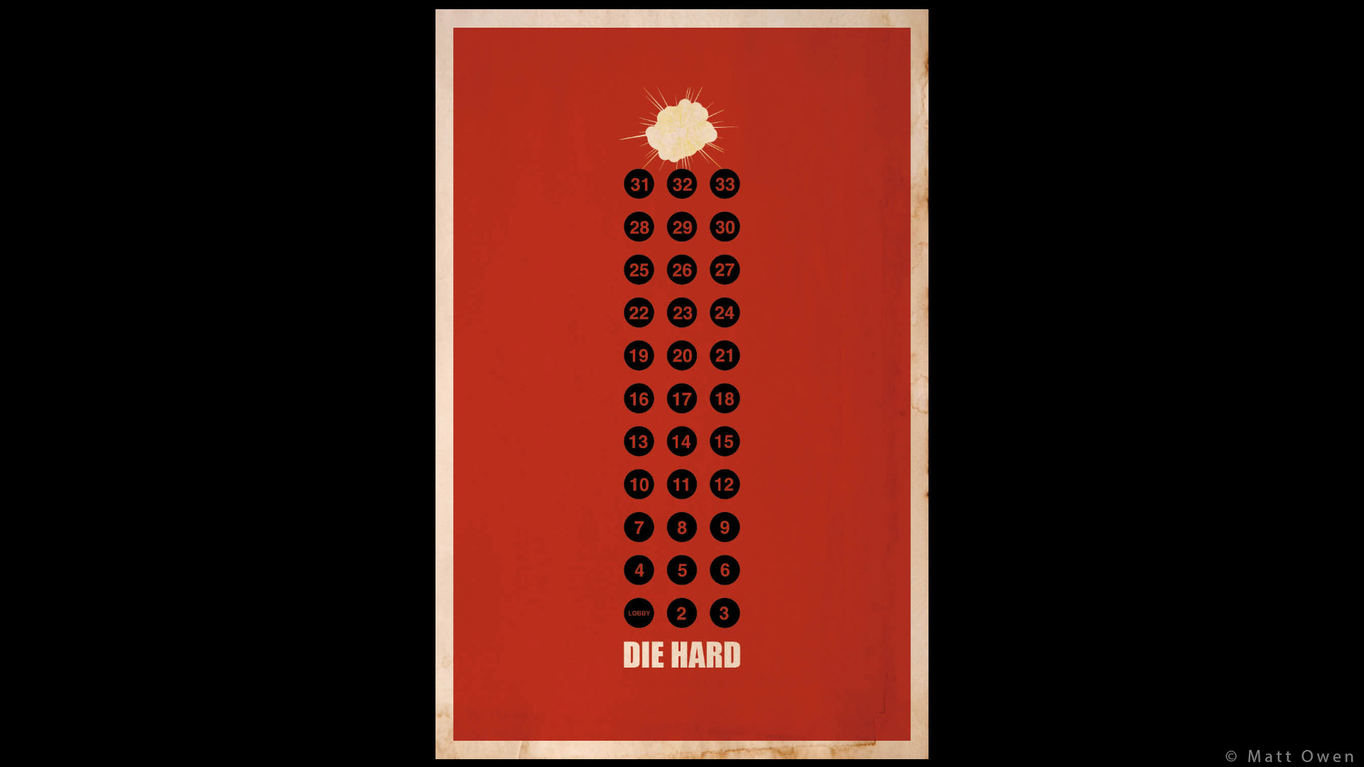
I am going to use some minimalist movie posters from Olly Moss, Jleeisme and Matt Owen as examples. In the following posters, our eyes follow the path from the bottom to the top of the picture.


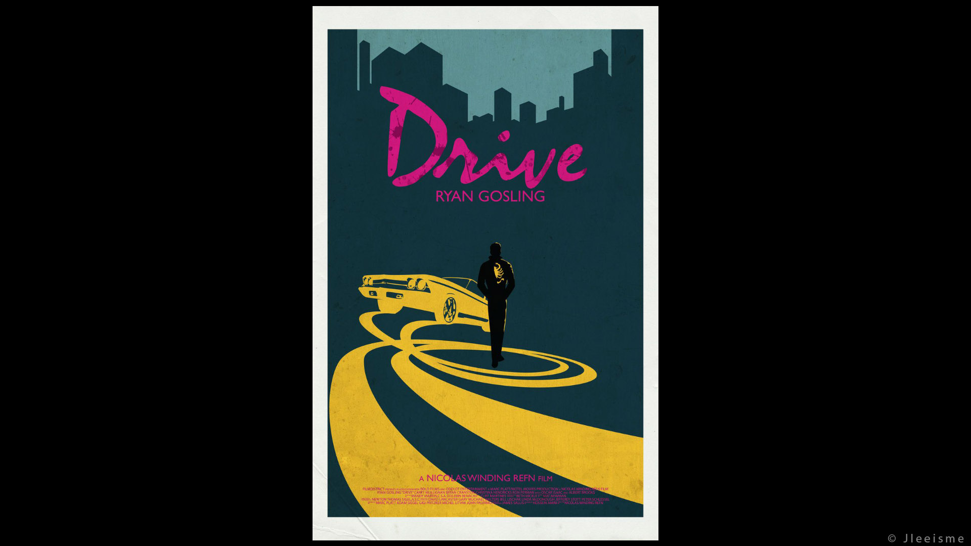

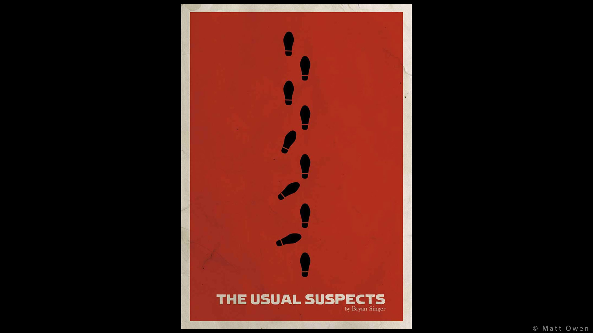
It is interesting to spot those principles in different art forms.
Figure & Ground principle
“Figure & Ground” is the equivalent of positive and negative space:
Negative or empty spaces will likewise be organized and grouped. […] For example, two different foreground colors let the viewer perceive different things from the same illustration.
Minimalist movie posters are the perfect example for Gestalt principles, because they need to use very few elements to make a clear statement. No extra detail, straight to the essential.
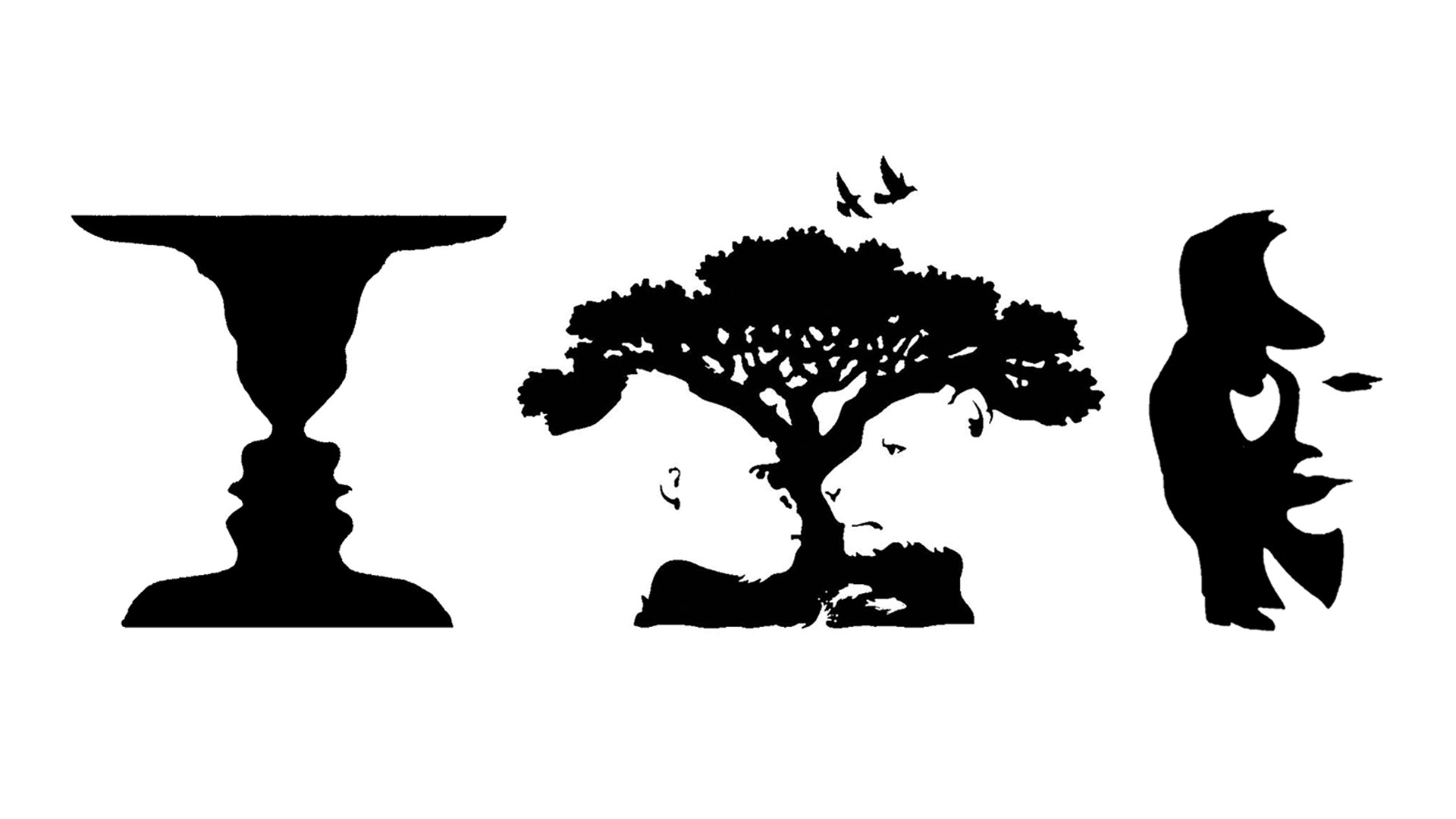


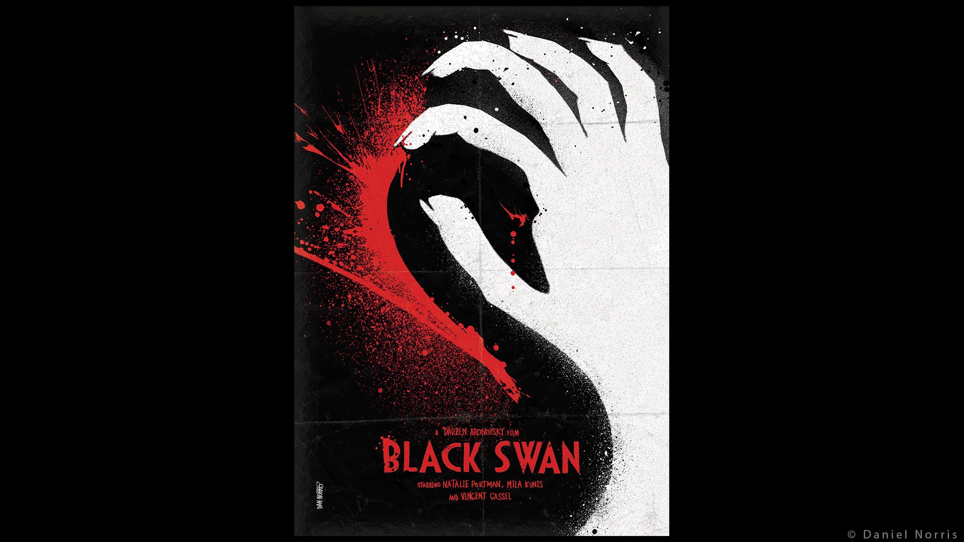
We also talk about negative space in chapter 6.
Closure principle
Patterns or objects that continue in one direction, even if interrupted by another pattern, are perceived as being continuous. […] Our minds will tend to close gaps and complete unfinished forms.


Animated movies are such a perfect example of Gestalt principles.
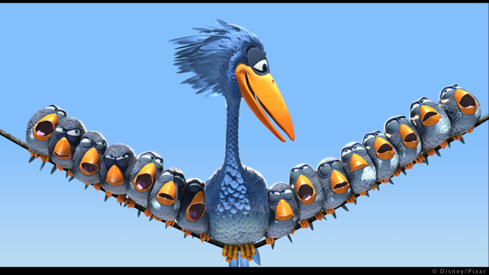
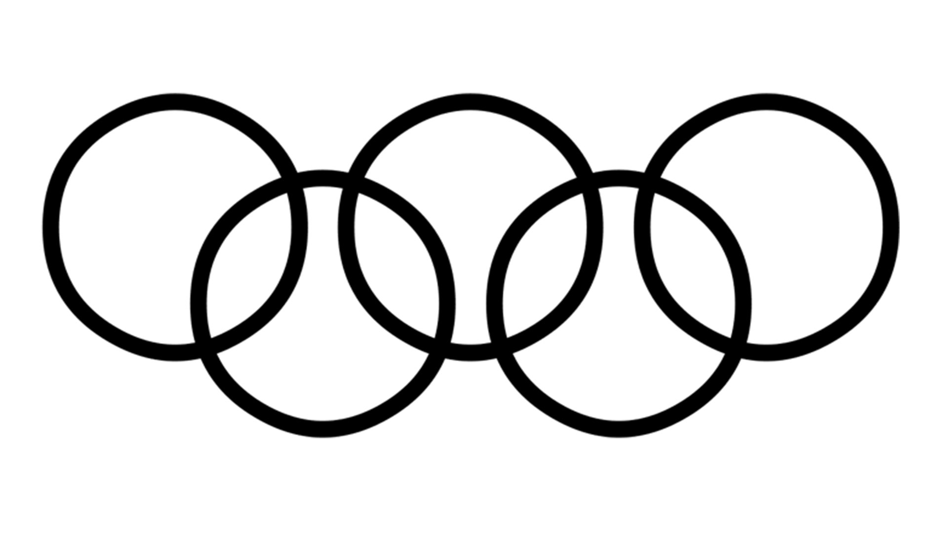
Common Fate principle
Humans perceive visual elements that move in the same speed and/or direction as parts of a single stimulus. A common example of this is a flock of birds.
The short film “Changes” (Director: Daniel Martinez Lara) is a great example of Gestalt Theory. It uses all kinds of Gestalt principles: proximity, similarity, common fate, isolation and even motion.
Other principles
There are so many laws that it would be very difficult to describe them all. I’ll just give you a few more:
- The law of unity & harmony. Elements of the composition appear to belong together, relate to each other, and to otherwise visually agree.
- The law of common region or enclosure. Elements tend to be perceived into groups if they are sharing an area with a clearly defined boundary.
- The law of connection. All images do not have the same meaning to us because we interpret their meanings based on our experiences.
- The law of isomorphic correspondence. The brain attempts to interpret the world by finding constancy. Interesting stuff.
Are you familiar with the work of Lou Romano ? He is an amazing concept artist using the Gestalt principles in most of his work.


Now that we have seen what the Gestalt principles are, we are going to focus on two of its main applications: Emphasis and Balance.
Emphasis (Principle of focal point)
Every visual presentation needs a focal point, called the center of interest or point of emphasis.
An image without emphasis is like wallpaper, the eye has no particular place to look and no reward for having tried. […] A composition may have more than one focal point, but one should dominate.
Contrast emphasis
Contrast can be achieved with shape, size, color, texture, brightness or even motion. A focal point results when one element differs significantly from other elements. […] Unique or minority elements within larger groups tend to attract our attention.
We’ll see more examples about contrast in chapter 6.
The character of Eve in Wall-e is a great example of contrast through shape, color and texture in the first part of the movie. She looks so different from everything else.
Tangent emphasis
Tangents, where two edges just touch each other, can produce a strong point of emphasis by creating visual tension.
I thought this to be very interesting because most of the time you want to avoid tangents. They really have a bad reputation in the CG industry. Here is an example from “There will be blood” (Director: Paul Thomas Anderson). I actually copied it from this blog:
The coerced baptism and humiliation of Plainview as he is forced to admit publicly his sins. A blindingly white cross dominates the frame, centrally located and positioned to literally rest upon the head of the kneeling Plainview (played by Daniel Day-Lewis). Never mind avoiding those tangents !

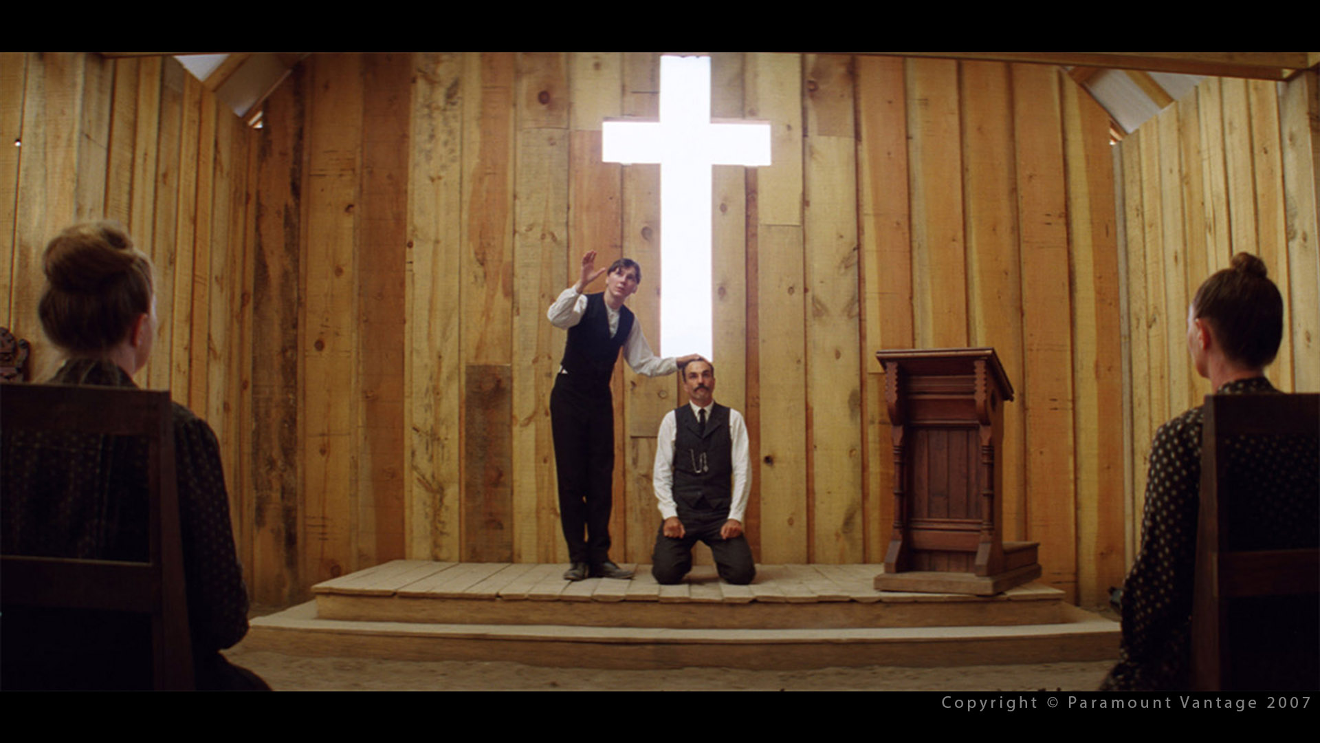
We generally try to avoid tangent contacts unless for obvious composition reasons.
With care, tangents can be created intentionally to attract viewer interest. However, most of the time they are accidental and distracting. So be watch out for them !
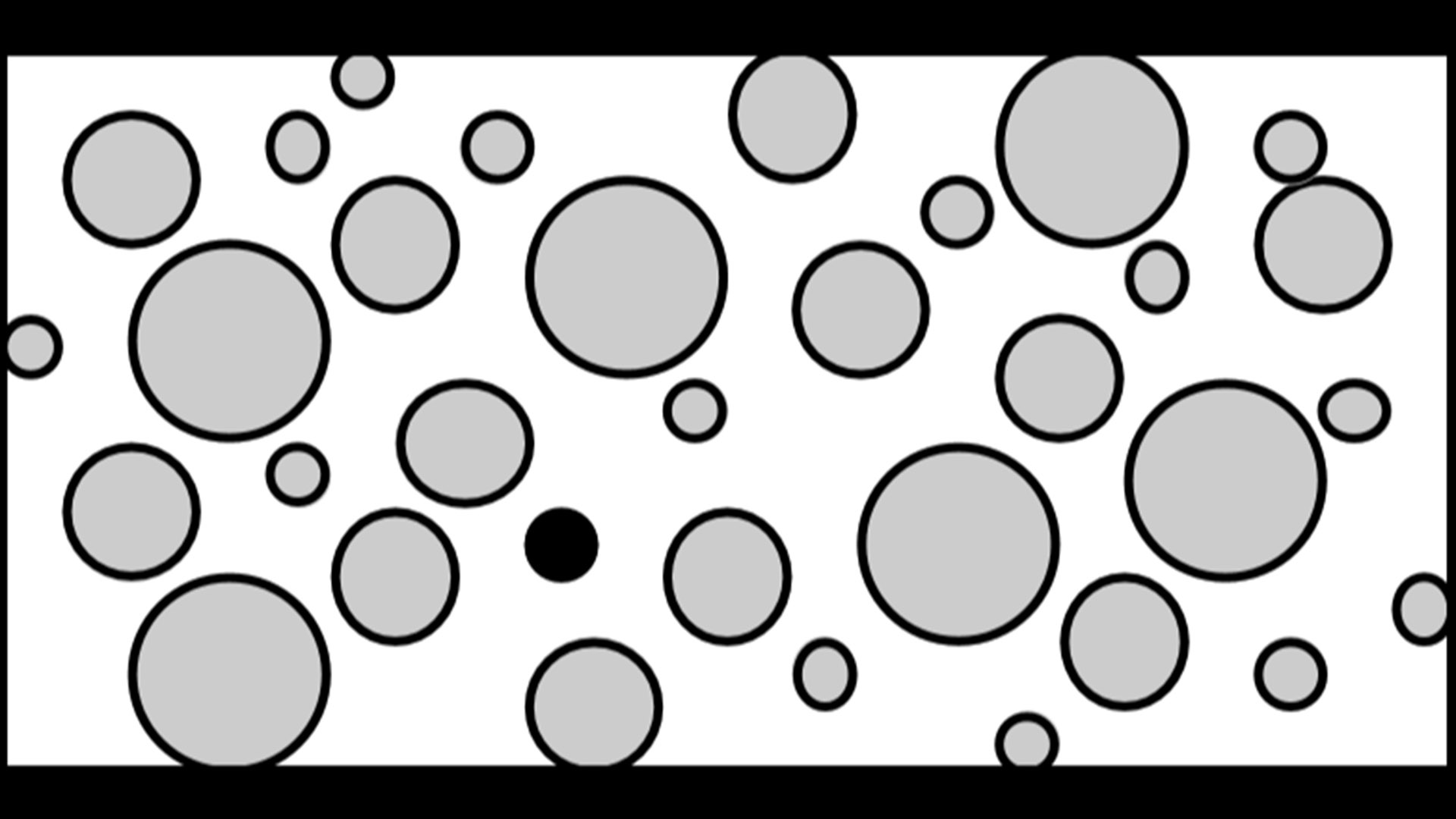
Isolation emphasis
When object defies grouping, by not being near or similar to any other object, it calls attention to itself and becomes a point of emphasis through tension.

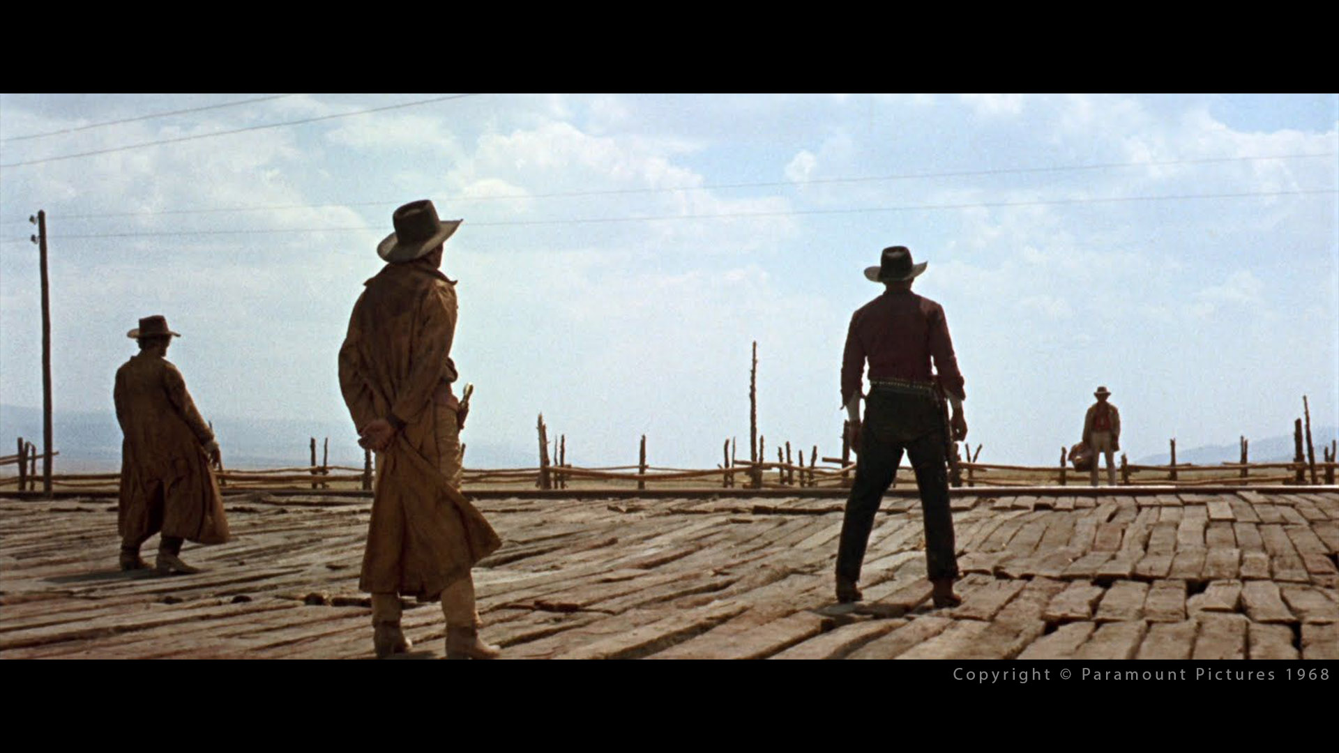
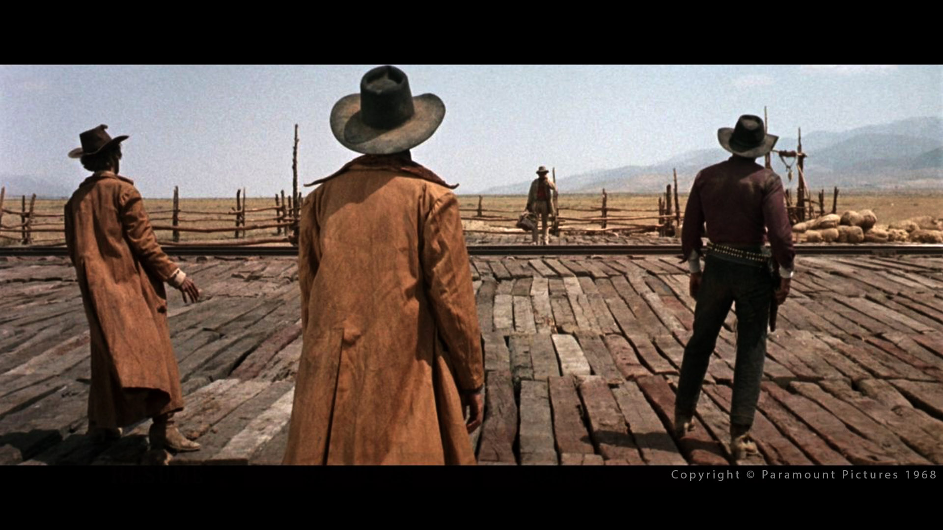
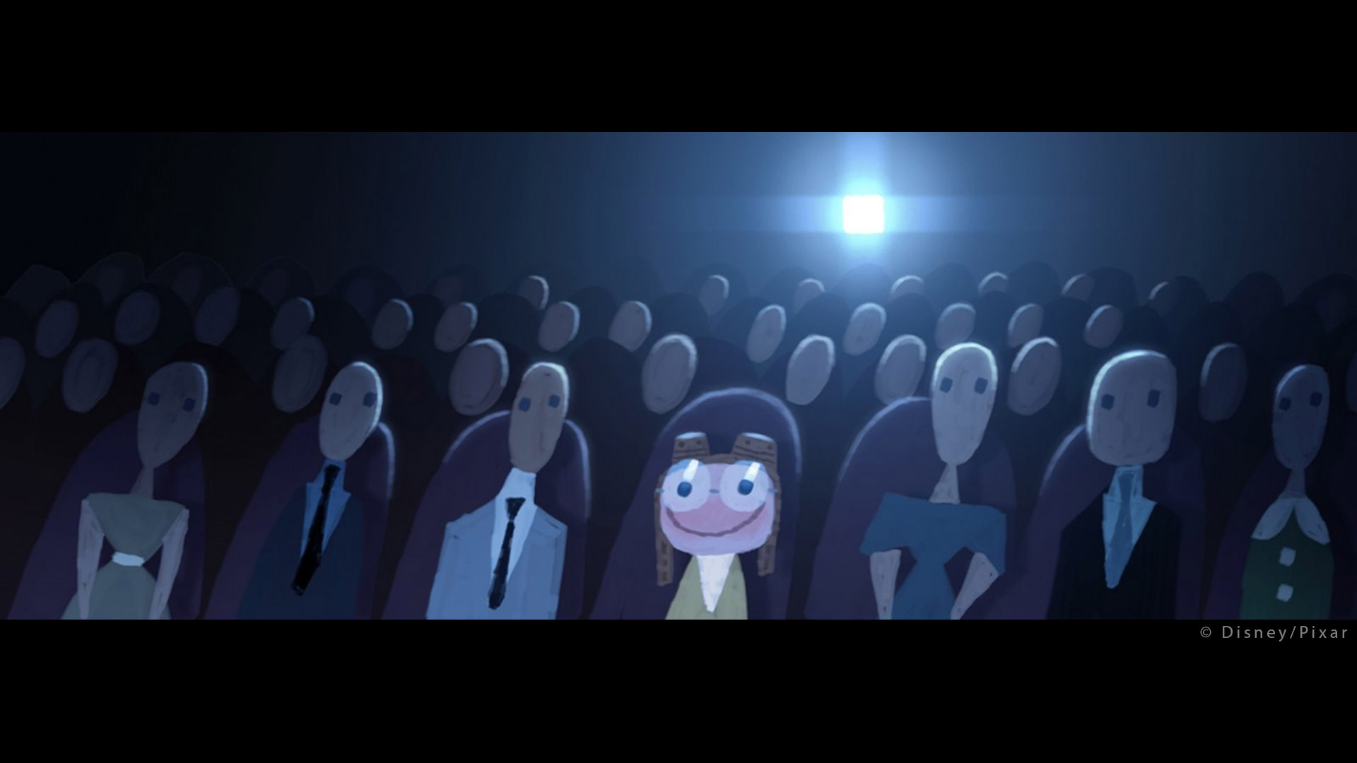
The lonely figure facing a group. Classic.
Angle emphasis
[…] Using perspective angles and other edges […] lead the eye to the focal point.


The following shot from “Happy Feet 2” (Director: George Miller) has a similar composition. A foreground element on the left looking at a background element on the right. Our eye goes straight at it. Why do we see so often this kind of composition, from left to right ? Probably because in western countries, we read from left to right.
Shape emphasis
The brain tends to characterize shape as either rectilinear or curvilinear. […] By creating an image with primarily one type, the other type becomes a point of emphasis.

The Gestalt theory says that an angle (hard shape) will catch more our attention than a circle (soft shape). In a render, the angle of a window can possibly be an issue as many times it catches our attention.
Recognition emphasis
Because of the human need for self-recognition, human or anthropomorphic characters will naturally attract more attention than inanimate objects.
Motion emphasis
If all objects are moving except one, the eye will be drawn to the one which is not moving. The opposite case, of only object moving, is more common and even more effective in attracting attention.
I thought the following shots from “Happy Feet 2” (Director: George Miller) would be a very good example. Bill and Will have the same designs and colors than their peers but they are swimming against them, which make them different and create emphasis.
Balance
When an object is unbalanced, it looks as though it will topple over. […] An entire image which is off-balance will make the viewer uncomfortable because he wants to balance it, but cannot. This discomfort can be desirable if it enhances the mood or story point.
Off-balance camera is called Dutch angle.
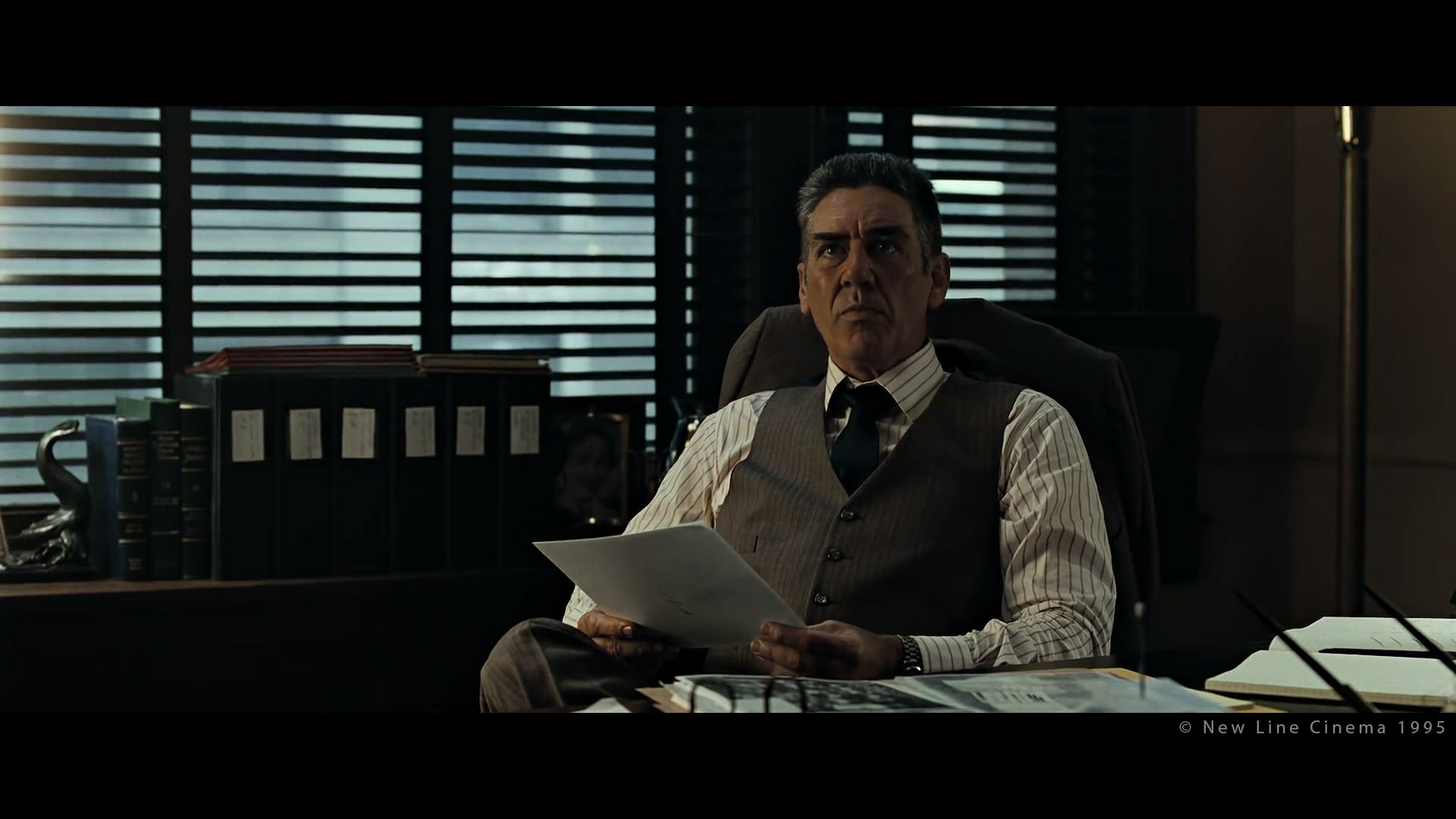
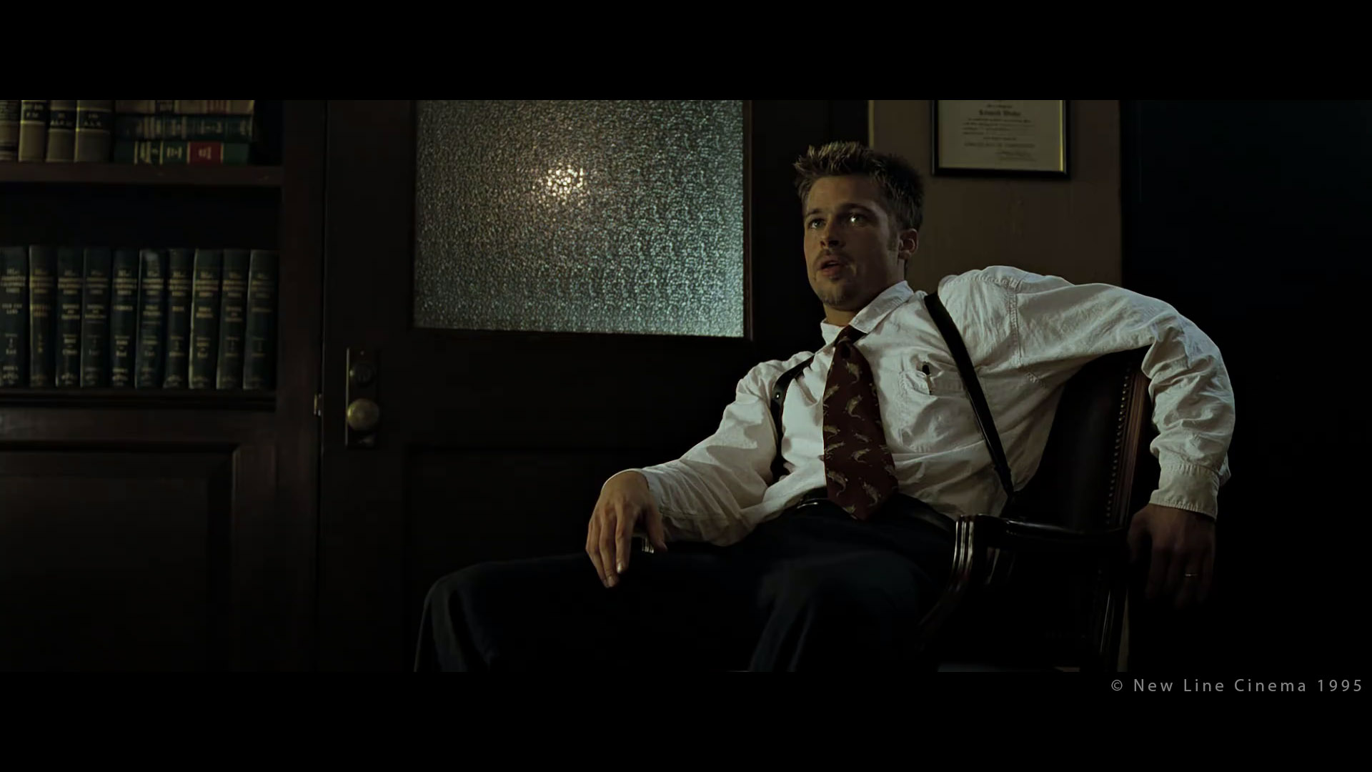
Dutch Angle
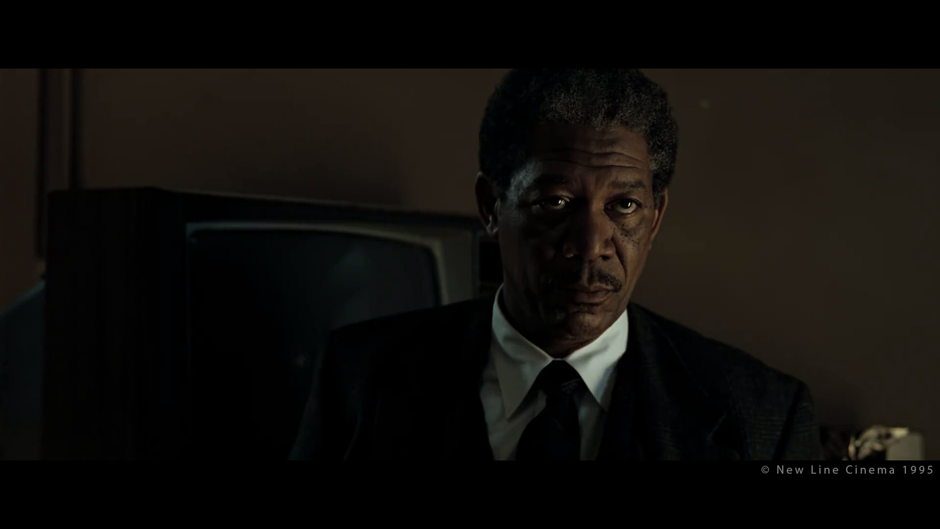
First example that comes to mind is from “Se7en” (Director: David Fincher, DP: Darius Khondji) When John Doe points a gun at detective Mills’ head (Brad Pitt), the camera is twisted to make the viewer feel uncomfortable. Great analysis here.


Dutch Angle can be used more or less subtly.
Symmetry: Horizontal balance
I found the following section very interesting:
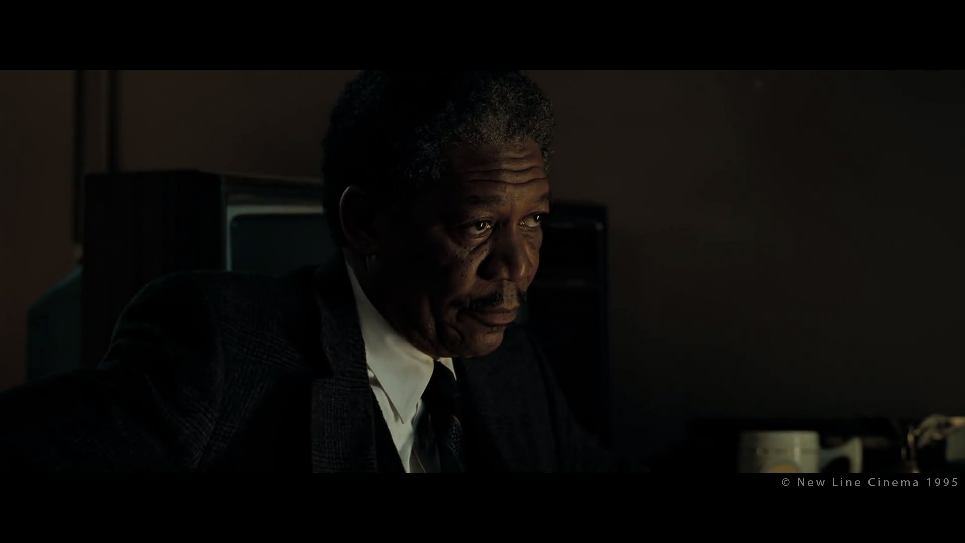
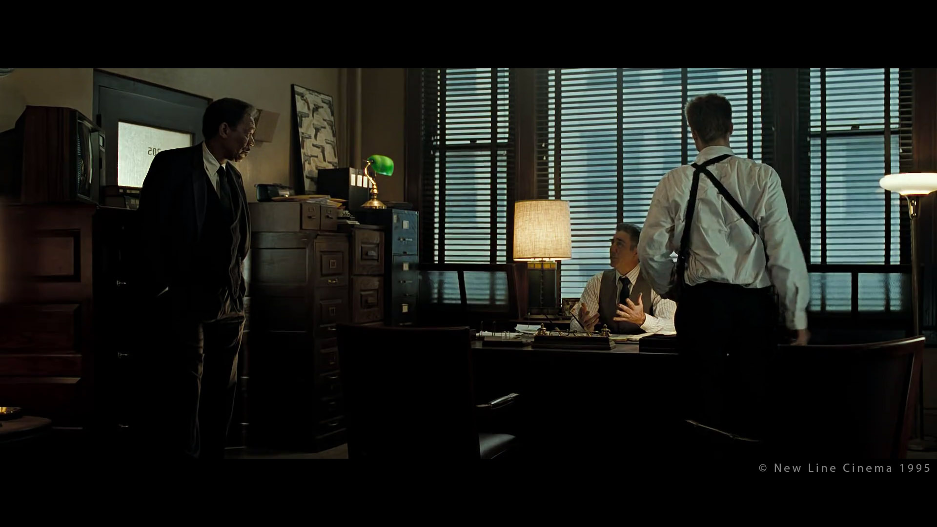
Visual balance is achieved using two equations. The first balances the image around a horizontal axis, where the two halves, top and bottom should achieve a sense of equilibrium. […] Where these horizontal divisions are, relative to where we are, tell us how tall we are, how far off the ground we might be, […] the placement of a character within the image format and the angle that the camera sees him can imply the height of a character. And since we tend to associate height as a dominating physical characteristic, it can say something about the importance of the character in his current situation.
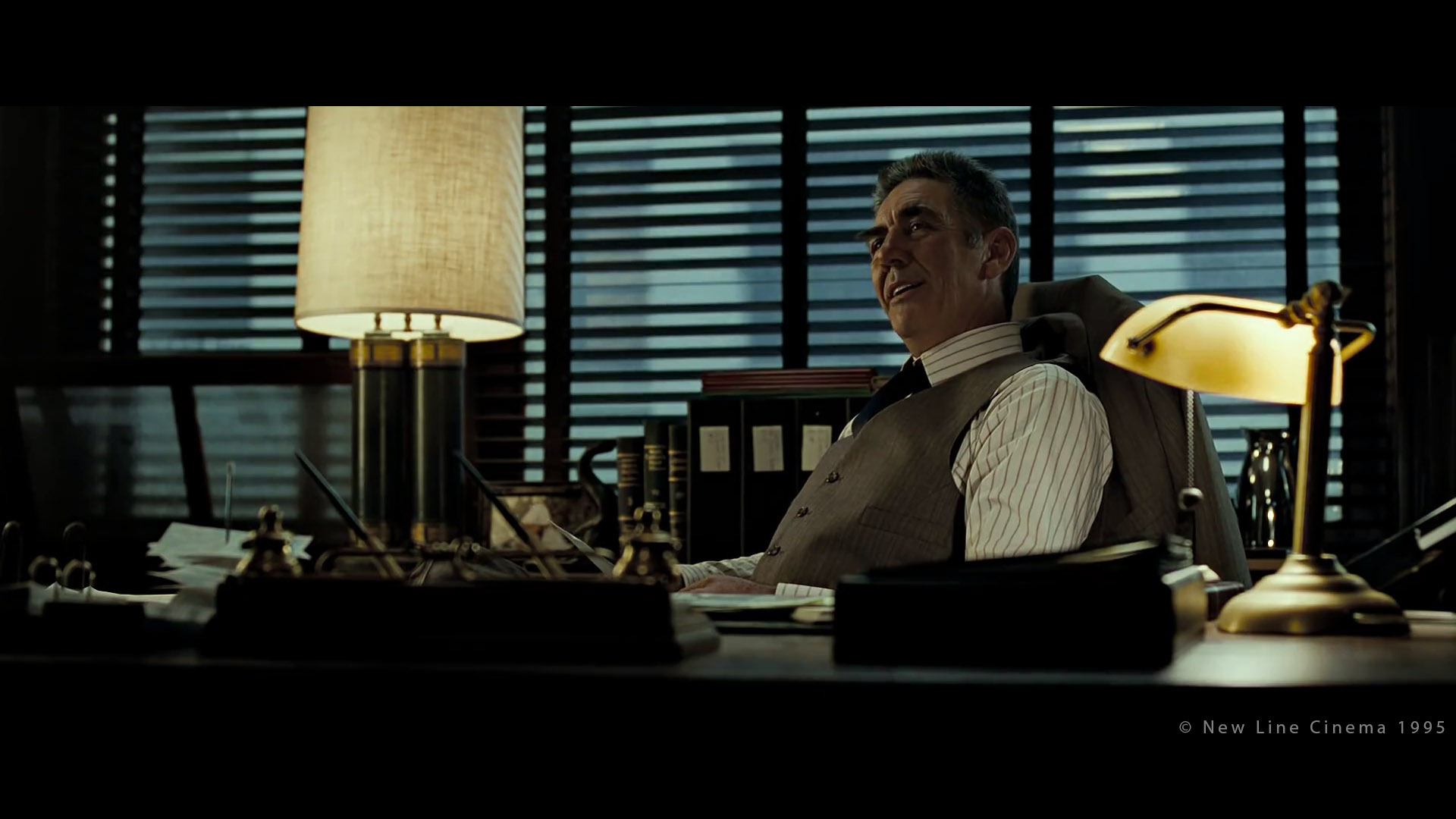
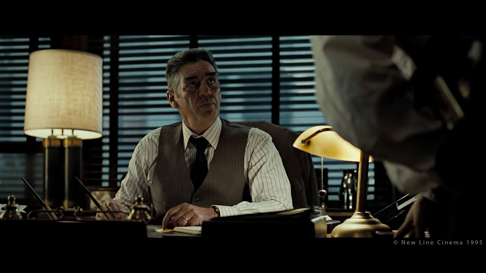
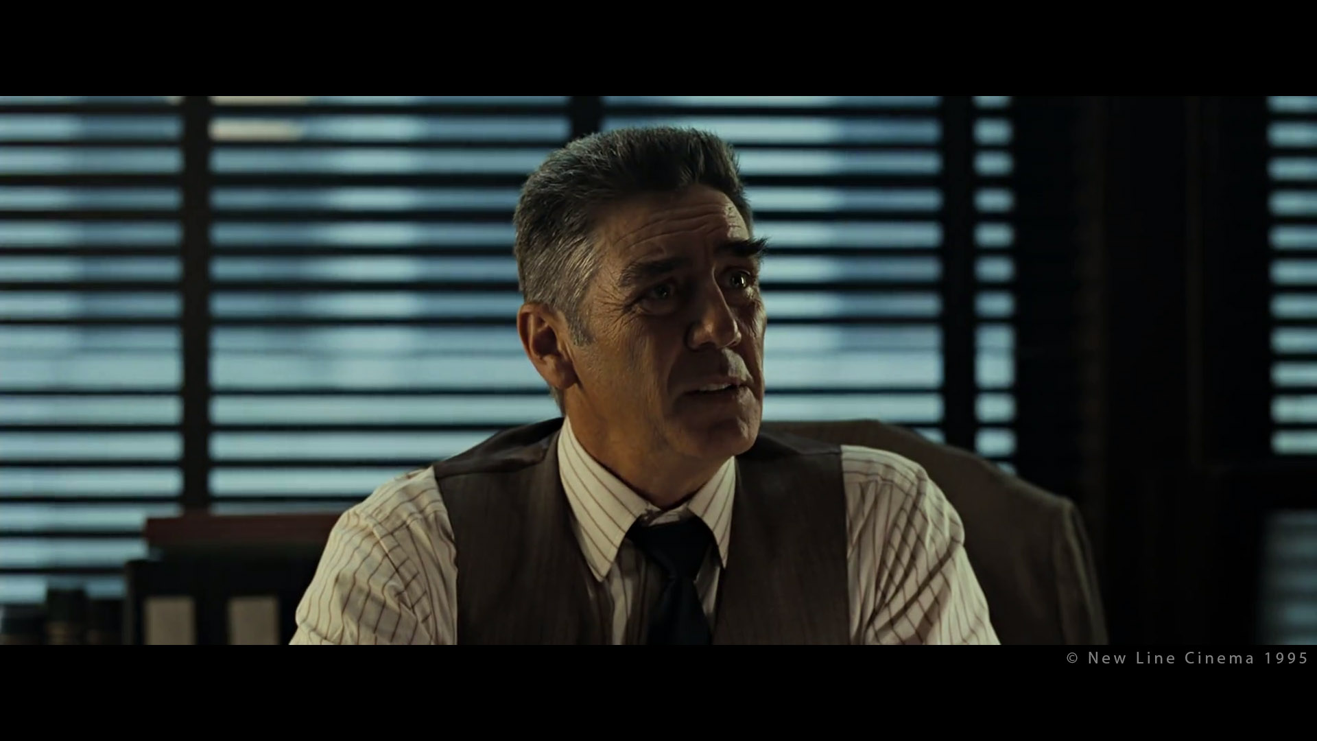
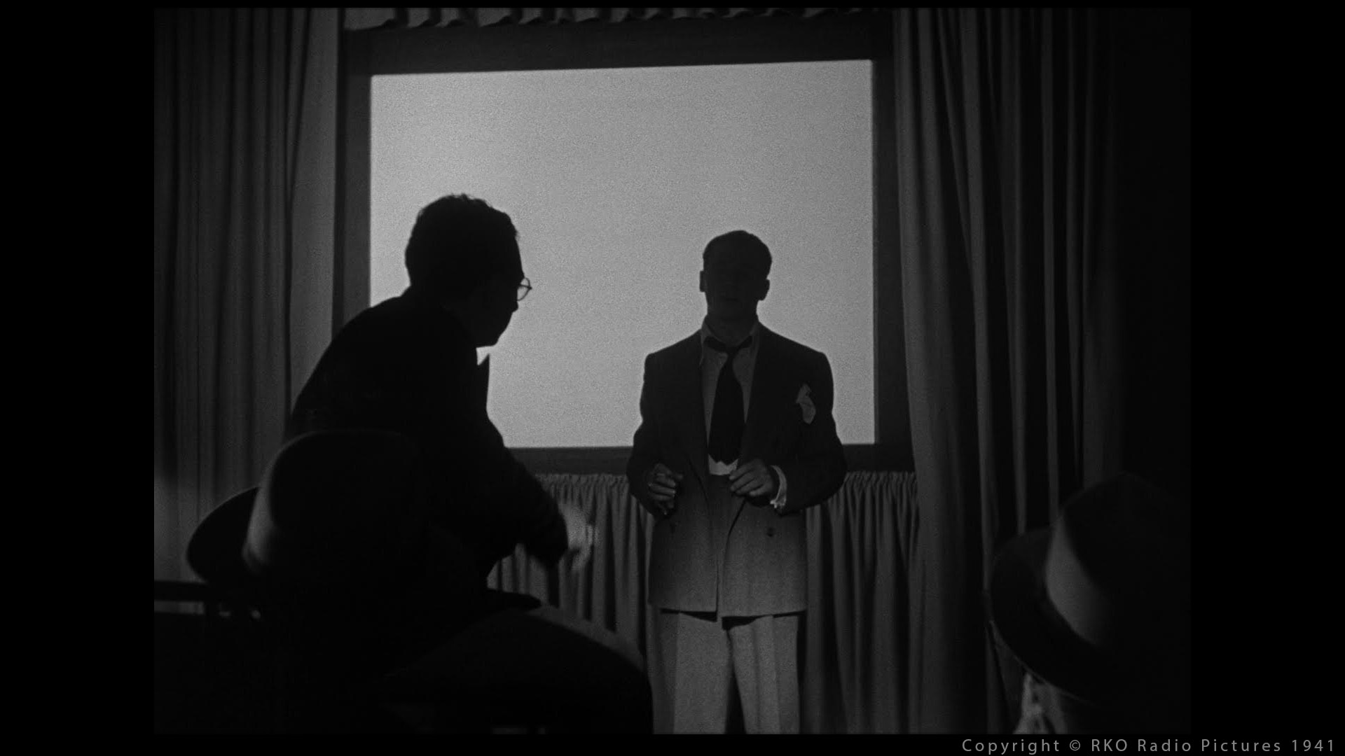
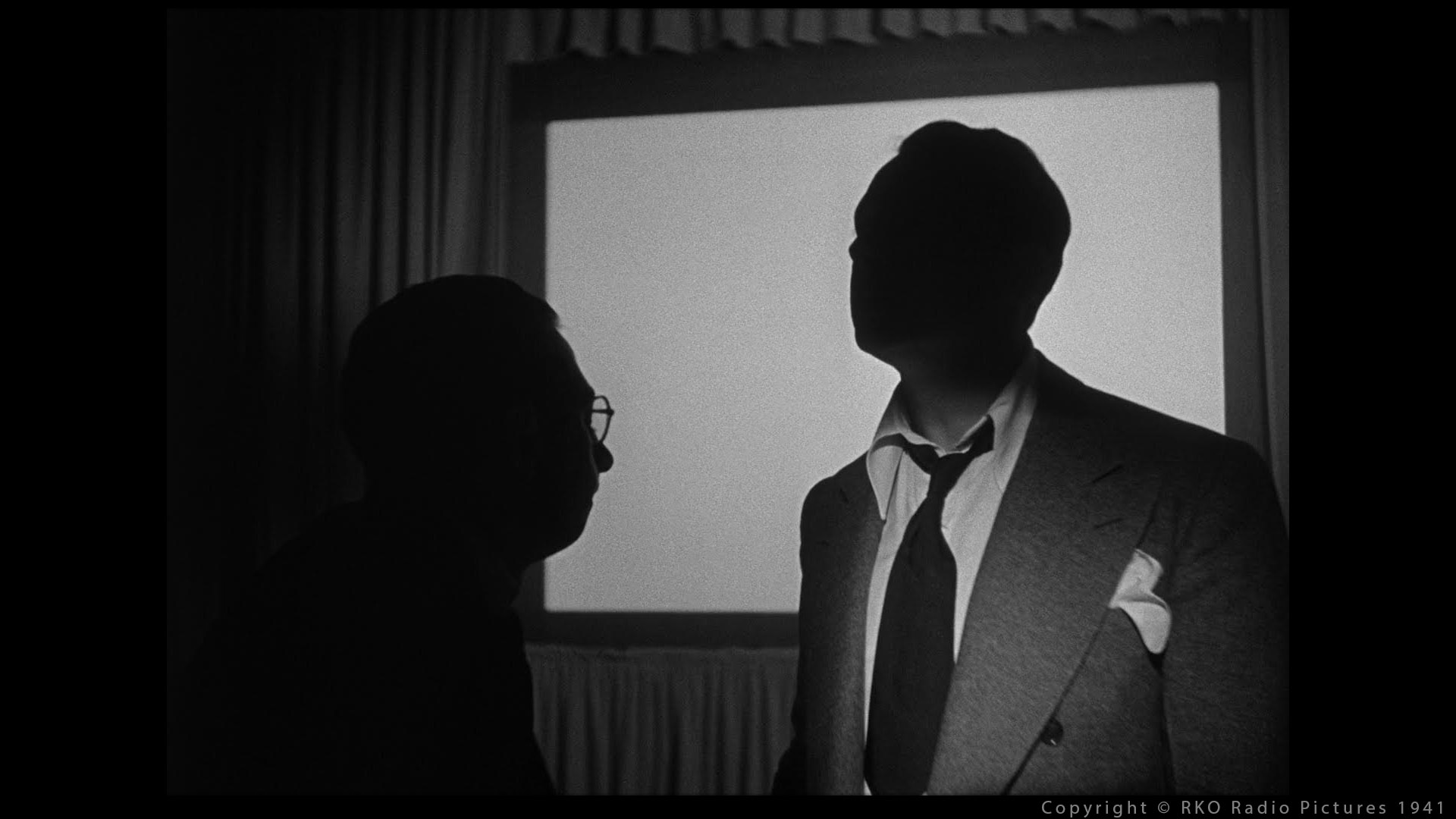
I think there is a perfect example to illustrate this concept. It comes from the movie “Se7en” (Director: David Fincher, DP: Darius Khondji). Let’s watch:


More examples can be found in the movie “Citizen Kane” (Director: Orson Welles, DP: Gregg Toland):

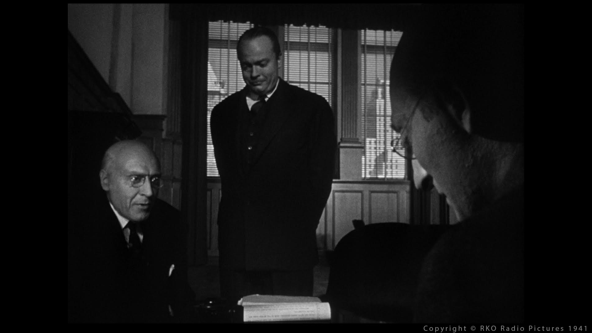

This is more a layout matter than lighting but it is still interesting to observe.
Even if I focus mostly on composition here, the lighting of Citizen Kane is so unique: counterchange and silhouette at its very best.
We will discuss these notions in Chapter 6.
Symmetry: Vertical balance
The second equation of visual balance divides the image around a central vertical axis. The horizontal format of cinema is most affected by this left / right ratio. […] A visual object will appear as incomplete if the visual object is not balanced or symmetrical. […] Heavily used in architecture, symmetrical balance feels very formal, permanent, strong, calm and stable.
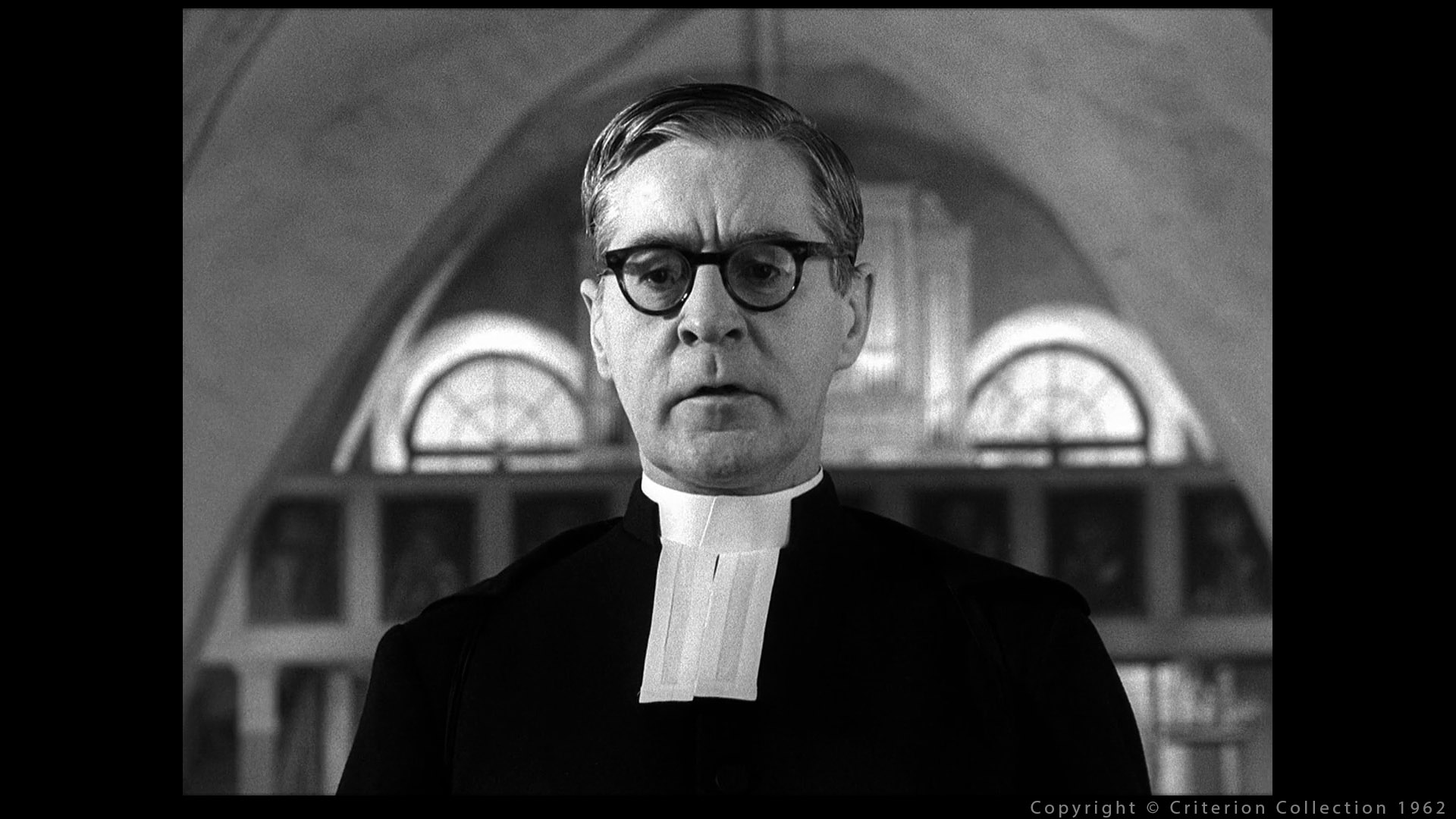
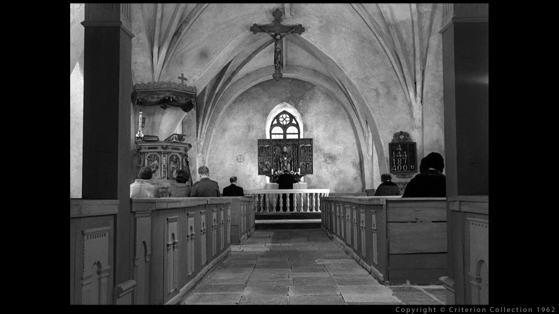

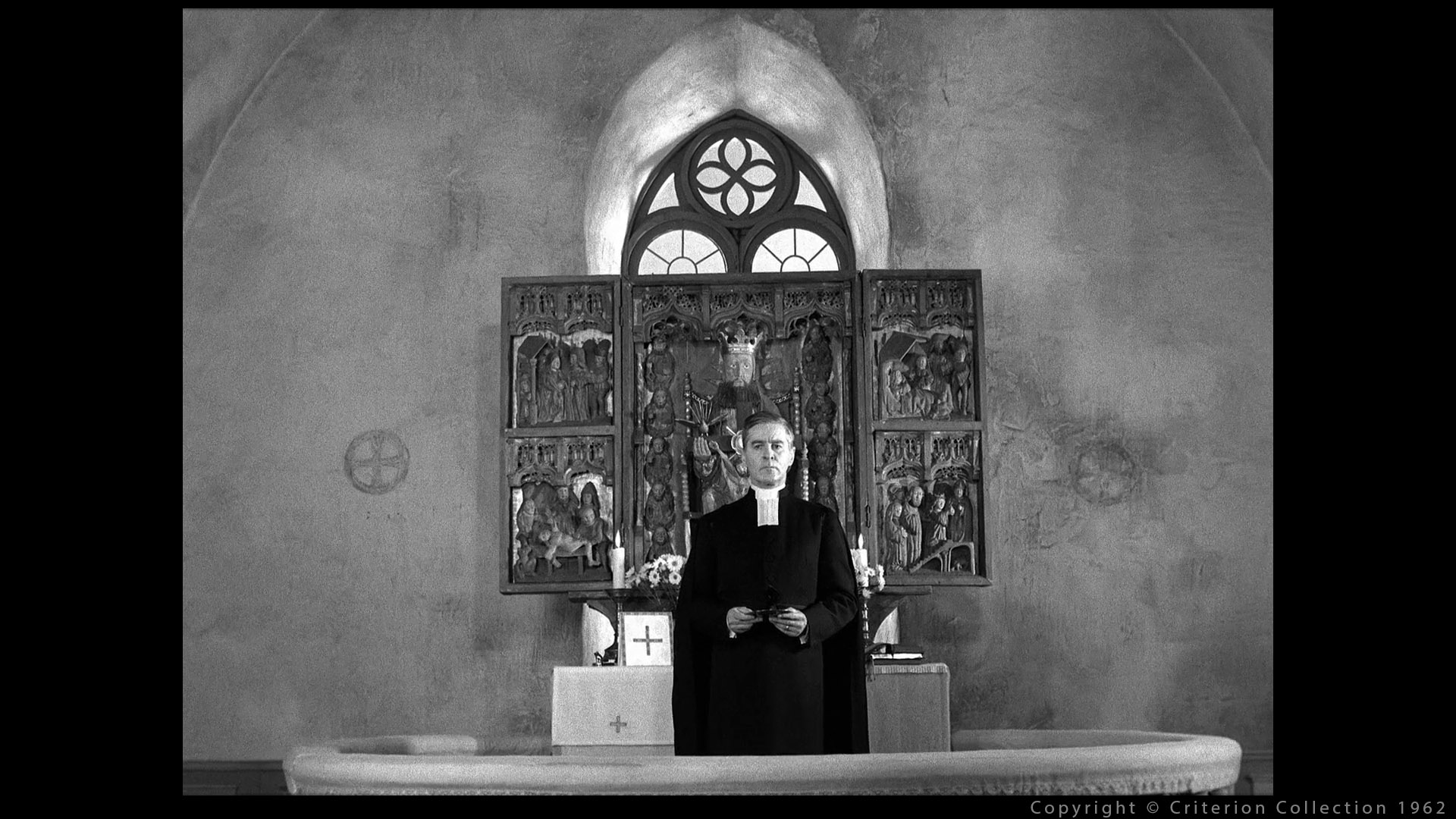

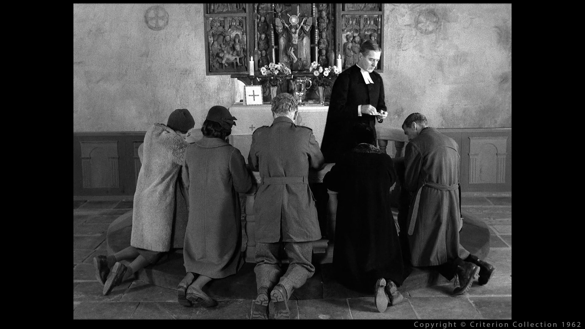
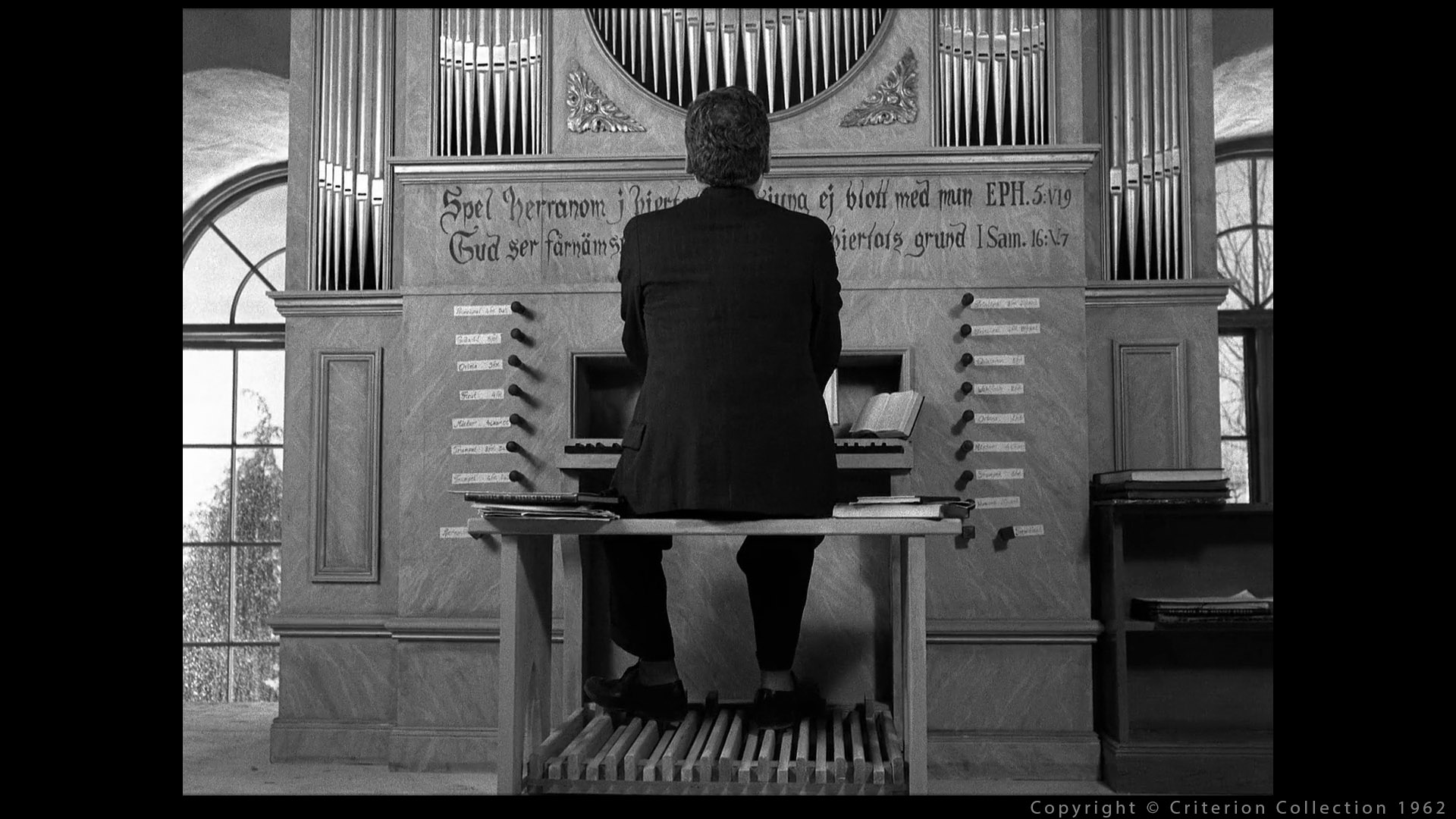
The Ingmar Bergman film “Winter Light” uses symmetrical balance to impart stiff, claustrophobic formality to the church setting in the opening sequence.
Wes Anderson is probably the director who uses the most symmetry in his films. As you can see in the next video. There is also plenty of articles on the topic.
But he is not the first. Stanley Kubrick used as well symmetric balance in his movies.
With two similar sides, there is an obvious visual importance to whatever element is placed on the center axis.
Asymmetrical Balance
A scale is balanced by putting equal weight on both sides. […] The balance of a composition is similar except that visual interest becomes the unit of measure. Visual interest comes in many shapes, sizes, values, colors and textures, each with varying density.


More examples can easily be found in various movies.
Composition
I really want to state this here: composition is key in a shot. I really think that a good framing is more important than a good lighting. Actually I would even say that lighting is probably the less important task in a movie. If I had to choose, I would rather have a good story and a so-so lighting than the other way around.
It seems to me that framing and composition are a bit overlooked in animation schools nowadays. As far as I know, Gestalt theory is barely mentioned in programs. This is why I really hoped this chapter could resonate with some readers.
You can check the blog from Hans Bacher about composition and Production Design.
Conclusion
Even if Gestalt Theory has been formulated around 1910, it clearly existed before that. Some even say that these principles were already applied in prehistoric art.


A big thank you to Matteo Caruso for helping me prepare these slides.
If you want to read a bit more about web visuals and Gestalt, this online article is mentioned in Dave Walvoord’s talk. The following explanation comes from it:
If you were to trace it back anthropologically, you might conclude that a hunter-gatherer mentality forced humans at one point to recognize that seeing relationships is a survival skill.
A bigger deer to hunt will feed you better.
Properly composing a frame is one of the most difficult task I have ever faced. But hopefully Gestalt Theory can give us the “tools” to design it properly. We are now (finally !) going to move on to proper lighting. Thanks for your patience.